11 Normal Linear Models

11.1 Linear regression
11.1.1 Background
Linear regression is the basis of a large part of applied statistical analysis. Analysis of variance (ANOVA) and analysis of covariance (ANCOVA) can be formulated as special cases of linear regression and are collectively named general linear models. Generalized linear models (Chapter 14) and mixed models (Chapters 13, 15) (and many other models) are extensions of linear regression.
Typical questions that can be answered using linear regression are: How does \(y\) change with changes in \(x\)? How is y predicted from \(x\)? An ordinary linear regression (i.e., one numeric \(x\) and a numeric \(y\) variable) can be represented by a scatterplot of \(y\) against \(x\). We search for the line that fits best through the points, and we can describe how the observations scatter around this regression line (Fig. 11.1). The model formula of a simple linear regression with one continuous predictor variable \(x_i\) (the subscript \(i\) denotes the \(i=1,\dots,n\) data points) is:
\[\begin{align} \mu_i &=\beta_0 + \beta_1 x_i \\ y_i &\sim normal(\mu_i, \sigma^2) \tag{11.1} \end{align}\]
The first part of Equation (11.1) describes the regression line; it is called the linear predictor (it is always simply a linear combination - that’s why all these models are called linear models). The second part describes how the data points, i.e. the observations, are distributed around the regression line (illustrated by normal distributions at two chosen x-values in Figure 11.1). In other words: with our model, we assume that the observation \(y_i\) stems from a normal distribution with mean \(\mu_i\) and variance \(\sigma^2\). The mean of the normal distribution, \(\mu_i\) , equals the sum of the intercept (\(b_0\) ) and the product of the slope (\(b_1\)) and the continuous predictor value, \(x_i\). \(y_i\) is also often called the fitted value, the estimated value or simply the estimate.
Equation (11.1) is called the data model, because it describes mathematically the process that has (or, better, that we think has) produced the data. This nomenclature also helps to distinguish data models from models for parameters such as prior or posterior distributions.
The differences between the observed y-values \(y_i\) and the predicted values \(\mu_i\) are the residuals (i.e., \(\epsilon_i=y_i-\mu_i\)). Equivalently to Equation (11.1), the regression could thus be written as:
\[\begin{align} y_i &= \beta_0 + \beta_1 x_i + \epsilon_i\\ \epsilon_i &\sim normal(0, \sigma^2) \tag{11.2} \end{align}\]
We prefer the notation in Equation (11.1) because, in this formula, the deterministic part (first row) is nicely separated from the stochastic part (second row) of the model, whereas, in the second notation (11.2) the first row contains both stochastic and deterministic parts. Also, for a generalized linear model (Chapters 14, 15), only Equation (11.1) can be formulated.
For illustration, we simulate data and then fit a linear regression to them. The advantage of simulating data is that the subsequent analyses can be reproduced without having to read data into R. Further, for simulating data, we need to translate the algebraic model formula into R language which helps us understand the model structure.
set.seed(34)            # set a seed for the random number generator
# define the data structure
n <- 50                 # sample size
x <- runif(n, 10, 30)   # sample values of the predictor variable

# define values for each model parameter
sigma <- 5              # standard deviation of the residuals
b0 <- 2                 # intercept
b1 <- 0.7               # slope

# simulate y-values from the model
mu <- b0 + b1 * x       # define the regression line (deterministic part)
y <- rnorm(n, mu, sd = sigma) # simulate y-values (stochastic part)

# save data in an object
dat <- tibble(x = x, y = y)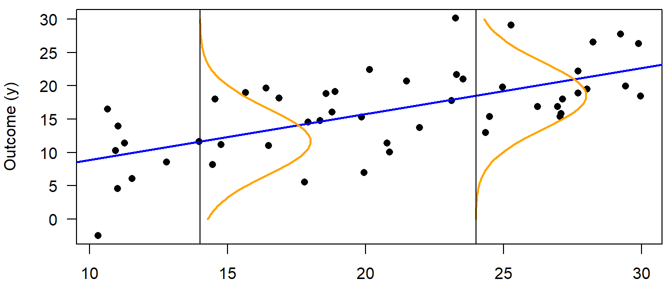
Figure 11.1: Illustration of a linear regression. The blue line represents the deterministic part of the model, i.e. the regression line (= the fitted value). The stochastic part is represented by a probability distribution, here the normal distribution (orange). The normal distribution changes its mean but not the variance along the x-axis, and it describes how the data are distributed around the fitted value. The blue line and the orange distribution together are a statistical model, i.e., an abstract representation of the data which is given in black.
We can use matrix notation to write our model more concisely. We will use this matrix multiplication when we make effectplots. Essentially, the matrix - called the model matrix - contains the predictor values in columns, plus a first column of 1s for the intercept. The model matrix is multiplied with the vector of coefficients (in our linear regression: intercept and slope) to yield the fitted values.
So, using matrix notation, Equation (11.1) can be written in one row:
\[\boldsymbol{y} \sim Norm(\boldsymbol{X} \boldsymbol{\beta}, \sigma^2\boldsymbol{I})\]
where \(\boldsymbol{ I}\) is the \(n \times n\) identity matrix (it transforms the variance parameter to a \(n \times n\) matrix with its diagonal elements equal \(\sigma^2\) ; \(n\) is the sample size). The multiplication by \(\boldsymbol{ I}\) is necessary because we use vector notation, \(\boldsymbol{y}\) instead of \(y_{i}\) . \(\boldsymbol{y}\) is the vector of all y-values, whereas \(y_{i}\) refers to a single observation, \(i\). When using matrix notation, we write the linear predictor of the model, \(\beta_0 + \beta_1 x_i\) , as a multiplication of the model matrix
\[\boldsymbol{X} = \begin{pmatrix} 1 & x_1 \\ \dots & \dots \\ 1 & x_n \end{pmatrix}\]
times the vector of the model coefficients
\[\boldsymbol{\beta} = \begin{pmatrix} \beta_0 \\ \beta_1 \end{pmatrix}\]
where \(x_1 , \dots, x_n\) are the observed values for the predictor variable \(x\). The first column of \(\boldsymbol{X}\) contains only ones because the values in this column are multiplied with the intercept, \(\beta_0\) . To the intercept, the product of each element of the second column of \(\boldsymbol{X}\) with the second element of \(\boldsymbol{\beta}\), \(\beta_1\), is added to obtain the predicted value for each observation, \(\boldsymbol{\mu}\):
\[\begin{align} \boldsymbol{X \beta}= \begin{pmatrix} 1 & x_1 \\ \dots & \dots \\ 1 & x_n \end{pmatrix} \times \begin{pmatrix} \beta_0 \\ \beta_1 \end{pmatrix} = \begin{pmatrix} \beta_0 + \beta_1x_1 \\ \dots \\ \beta_0 + \beta_1x_n \end{pmatrix}= \begin{pmatrix} \hat{y}_1 \\ \dots \\ \hat{y}_n \end{pmatrix} = \boldsymbol{\mu} \tag{11.3} \end{align}\]
In R, we will use the function model.matrix to easily create the model matrix. This can then be matrix-multiplied (symbol %*% in R) to get the fitted values.
11.1.2 Fitting a linear regression in R
11.1.2.1 Background
In Equation (11.1), the fitted values \(\mu_i\) are defined by the model coefficients, \(\beta_{0}\) and \(\beta_{1}\) . Therefore, when we can estimate \(\beta_{0}\), \(\beta_{1}\), and \(\sigma^2\), the model is fully defined. The third parameter, \(\sigma^2\), describes how the observations scatter around the regression line and relies on the assumption that the data points are normally distributed around the fitted value, i.e. around the regression line. The estimates for the model parameters of a linear regression are obtained by searching the best fitting regression line, which is generally defined as the line that minimizes the sum of the squared residuals. This model fitting method is called the least-squares method, abbreviated as LS. It has a very simple solution using matrix algebra (see e.g., Aitkin et al. 2009), which is one reason why the least-squares regression line is generally used (and not, e.g., a line that minimizes the absolute residuals).
Least-squares is a fitting technique: a technique that finds the best fitting line, i.e. the intercept and slope of that line, plus the sigma, together with a standard error for each of them. It is not, per se, a classical frequentist method - the frequentist part only comes in when we postulate a null hypothesis, e.g. \(beta_1 = 0\), and test whether we can falsify this null hypothesis. As explained in Chapter 2.6, we prefer the Bayesian approach over frequentist null hypothesis testing.
In the following, we present two approaches to fit the linear regression and make inferences from the model:
- We use the LS approach (function
lm) to fit the regression line. Then we use the functionsimfrom package arm to draw values from the joint posterior distribution. - We use to program Stan via the packages rstanarm and brms to directly draw from the joint posterior distribution
The second option is “fully Bayesian” in that it does not first fit the line with LS. Even though the two approaches (LS vs. fully Bayesian) are completely different, both yield the same solution (given flat priors for the Bayesian approach), i.e. the line that minimizes the squarred residuals.
We now first fit the line using lm + sim, then using functions from rstanarm and brms. Then, we visualize the results for each approache.
11.1.2.2 Fitting a linear regression using lm, then use sim
The least-squares estimates for the model parameters of a linear regression are obtained in R using the function lm.
## (Intercept)           x
## 2.0049517 0.6880415## [1] 5.04918The object “mod” produced by lm contains the estimates for the intercept \(\beta_0\) and the slope \(\beta_1\). The residual standard deviation \(\sigma\) is extracted using the function summary (sigma(mod) works, too). We can show the result of the linear regression as a line in a scatter plot with the covariate (x) on the x-axis and the outcome variable (y) on the y-axis (Fig. 11.2).
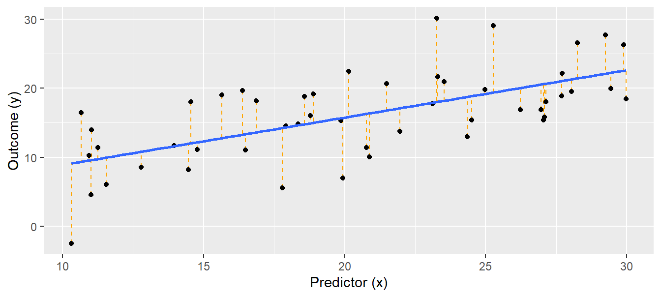
Figure 11.2: Linear regression. Black dots = observations, blue solid line = regression line, orange dotted lines = residuals. The fitted values lie where the orange dotted lines touch the blue regression line.
Using lm, as said, is not Bayesian. But we can easily go the Bayesian way thanks to the function sim from the package arm. It takes a model object fitted with lm (or glm, lmer, glmer and a few more) and returns draws from the joint posterior distribution (we can also say, sim “simulates” values from the posterior, but we prefer “to draw”). From the joint posterior distribution, we can get, for each parameter, the estimated value and its uncertainty, e.g. the 95% compatibility interval.
We can use the joint posterior distribution (often just called “the posterior”) to draw effectplots that show the relationship of y on x including the uncertainty. An effectplot is essentially a “derived parameter” from the parameter estimates, because we use the estimates, i.e. intercept and slope in the case of a simple linear regression, and draw the regression line, including its uncertainty. We can also calculate other derived parameters from the posterior - whatever makes sense to understand the system under study. This is the great magic about the Bayesian approach: whatever derived parameter we want to look at, we simply calculate it for each of the e.g. 4000 draws from the posterior, and, thereby, we propagate the uncertainty in the parameter estimates to our derived parameter (error propagation).
What does sim do?
It draws parameter values from the joint posterior distribution of a model assuming flat prior distributions. For a normal linear regression, it first draws a random value, \(\sigma^*\) from the marginal posterior distribution of \(\sigma\), and then draws random values from the conditional posterior distribution for \(\boldsymbol{\beta}\) given \(\sigma^*\) (A. Gelman et al. 2014).
The conditional posterior distribution of the parameter vector \(\boldsymbol{\beta}\), \(p(\boldsymbol{\beta}|\sigma^*,\boldsymbol{y,X})\) can be analytically derived. With flat prior distributions, it is a uni- or multivariate normal distribution \(p(\boldsymbol{\beta}|\sigma^*,\boldsymbol{y,X})=normal(\boldsymbol{\hat{\beta}},V_\beta,(\sigma^*)^2)\) with:
\[\begin{align} \boldsymbol{\hat{\beta}=(\boldsymbol{X^TX})^{-1}X^Ty} \tag{11.4} \end{align}\]
and \(V_\beta = (\boldsymbol{X^T X})^{-1}\).
The marginal posterior distribution of \(\sigma^2\) is independent of specific values of \(\boldsymbol{\beta}\). It is, for flat prior distributions, an inverse chi-square distribution \(p(\sigma^2|\boldsymbol{y,X})=Inv-\chi^2(n-k,\sigma^2)\), where \(\sigma^2 = \frac{1}{n-k}(\boldsymbol{y}-\boldsymbol{X,\hat{\beta}})^T(\boldsymbol{y}-\boldsymbol{X,\hat{\beta}})\), and \(k\) is the number of parameters. The marginal posterior distribution of \(\boldsymbol{\beta}\) can be obtained by integrating the conditional posterior distribution \(p(\boldsymbol{\beta}|\sigma,\boldsymbol{y,X})=normal(\boldsymbol{\hat{\beta}},V_\beta\sigma^2)\) over the distribution of \(\sigma^2\) . This results in a uni- or multivariate \(t\)-distribution.
Because sim draws values \(\beta_0^*\) and \(\beta_1^*\) always conditional on \(\sigma^*\), a triplet of values (\(\beta_0^*\), \(\beta_1^*\), \(\sigma^*\)) is one draw from the joint posterior distribution. When we visualize the distribution of the drawn values for one parameter only, ignoring the values for the other, we display the marginal posterior distribution of that parameter. Thus, the distribution of all draws for the parameter \(\beta_0\) is a \(t\)-distribution even though a normal distribution has been used to draw the values. The \(t\)-distribution is a consequence of using a different \(\sigma^2\)-value for every draw of \(\beta_0\).
library(arm)
nsim <- 1000  # in real analyses, we set nsim to 5000 or more; rstanarm and brms have a default of 4000
bsim <- sim(mod, n.sim = nsim)
The function sim draws (in our example) 1000 values from the joint posterior distribution of the three model parameters \(\beta_0\) , \(\beta_1\), and \(\sigma\). These drawn values are shown in Figure 11.3.
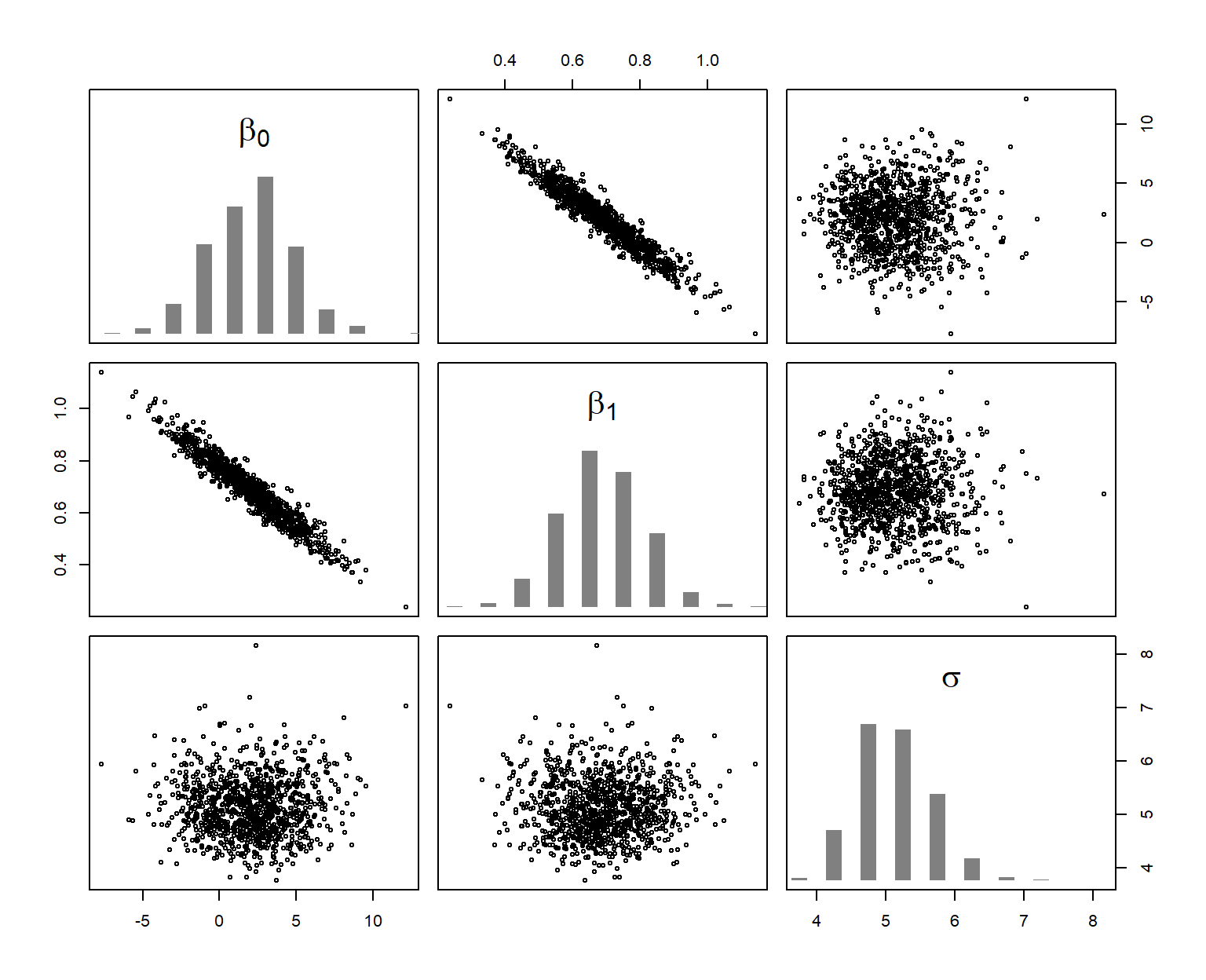
Figure 11.3: Joint distribution (scatterplots) and marginal (histograms) posterior distributions of the model parameters. The six scatterplots show, using different axes, the three-dimensional cloud of 1000 draws from the joint posterior distribution of the three parameters.
The posterior distribution describes, given the data and the model (assumptions), what values are most likely to correspond to the true parameter value. It expresses the uncertainty of the parameter estimate. It shows what we know about the model parameter after having looked at the data and given the model is realistic.
The posterior distribution has as many dimensions as there are parameters to estimate. To say something about one parameter, we look at the marginal posterior distribution of that parameter. This is simply the joint posterior distribution projected onto the axis of the parameter (histograms in Figure 11.3). The 2.5% and 97.5% quantiles of the marginal posterior distribution can be used as 95% compatibility interval of the model parameter.
The function coef extracts the drawn values for the beta coefficients (intercept and slope for a simple linear regression), returning a matrix with nsim rows and the number of columns corresponding to the number of parameters. In our example, the first column contains the draws from the marginal posterior distribution of the intercept, and the second column contains draws for the slope. The “2” in the second argument of the apply function indicates that the quantile function is applied columnwise.
##       (Intercept)    x
## 2.5%        -2.95 0.44
## 97.5%        7.17 0.92
We also can calculate a compatibility interval of the estimated residual standard deviation, \(\hat{\sigma}\).
##  2.5% 97.5%
##   4.2   6.3
We can further get a posterior probability for specific hypotheses, such as “The slope parameter is larger than 1” or “The slope parameter is larger than 0.5”. These probabilities are the proportion of simulated values from the posterior distribution that are larger than 1 and 0.5, respectively.
## [1] 0.008## [1] 0.936From this, there is very little evidence in the data that the slope is larger than 1, but we are quite confident that the slope is larger than 0.5 (assuming that our model is realistic).
To really understand what our model tells us, we make effectplots. But first, we point out the importance of checking the model assumptions, then provide alternative ways of getting draws from the posterior using rstanarm and brms, and then make the effectplot to show the relationship between x and y.
11.1.2.3 Checking model assumptions
Conclusions drawn from a model depend on the model assumptions. When model assumptions are violated, estimates usually are biased and inappropriate conclusions can be drawn. We devote Chapter 12 to the assessment of model assumptions, given its importance. Checking model assumptions is equally important independent of whether you use sim (on a model object from lm, glm, lmer, glmer) or the following two approaches to get draws from the joint posterior distribution using packages rstanarm and brms.
11.1.2.4 When we use rstanarm and brms
Above, we have used sim to get draws from the posterior. This works fine and fast, but we are limited in the model types we can use (no zero-inflated model, autocorrelation cannot be included, etc.), and there are no downstream functions once we have the draws. If we cannot do the task with sim, we generally do it with the functions from rstanarm, which offer more flexibility. If it does not work with these, we use the package brms.
Different approaches to fit a Bayesian model
There are different options to fit a model in a Bayesian framework in R. The following list is not exhaustive, it only represents our currently preferred way of fitting models.
- Function
simfrom package arm: This function takes a model object fitted withlm,glmor a function from the lme4 package or polr, and returns draws from the joint posterior distribution. This approach is computationally fastest and safest (fewer warnings, fewer issues with convergence). - Functions of the package rstanarm: Uses Stan under the hood and is fully Bayesian, e.g. you may provide informative priors. It fits some more models than the first approach (e.g. negative binomial models), it is faster than brms and has less convergence problems. There are great downstream options (e.g. posterior predictive model checking, cross-validation), but fewer than with
brm. - Function
brmfrom package brms: As rstanarm, uses Stan. This approach takes more time for fitting but offers many additional options such as treating autocorrelation (and much more!) and offeres additional downstream options (e.g. the functionconditional_effectsto make effectplots). - Stan: This is a powerful MCMC sampler, but coding the model in Stan itself is more difficult.
- Bugs (WinBugs, OpenBugs) and jags: These are MCMC samplers intensively used in ecology e.g. for fitting (also very complex) models with latent variables, e.g. survival models, integrated population models, etc. Model coding may be learned using book like (Kéry 2010) and (Kéry and Schaub 2012).
- nimble: as Bugs, but may be faster for some models, with more flexibility e.g. to create custom MCMC samplers.
For the models treated in this book, we extensively use the first three approaches, generally choosing the simplest possible (i.e. sim if possible, else rstanarm, else brm), for computation speed reasons. Using rstanarm or brm may be chosen for models feasible also with sim for the great downstream options (simple generation of effectplots - especially when such are needed for random slope models, posterior predictive model checking, or cross validation).
Below we fit the linear regression using a function from package rstanarm (Goodrich et al. 2023), and then the function brm from the package brms (Bürkner 2017). These functions allow fitting Bayesian generalized (non-)linear multivariate multilevel models using Stan (M~J Betancourt 2013) for full Bayesian inference. We shortly introduce the fitting algorithm used by Stan, Hamiltonian Monte Carlo, in chapter 18.
for installing rstanarm and brms, we provied some experience in Chapter 18.
When using the functions from rstanarm (in our book mainly stan_glm, stan_lmer, stan_glmer) or brms (function brm) to fit a model, there is no need to write the model in Stan-language. You can use model coding familiar from functions such as lm, glm, lmer and glmer, and rstanarm / brms translate it to Stan code, sends it to be fitted in Stan (via the rstan package) and returns the draws from the joint posterior distribution.
rstanarm provides a few more data distributions that what can be handled with sim, but for us, the main advantage of rstanarm are the downstream functionalities such as posterior predictive model checking, cross-validation and functions helping to create effectplots. brms also provides all these downstream functionalities (and even more), but the main plus is that it also offers a wide range of data distributions (many more than Gauss, Poisson, and binomial) as well as options to account for autocorrelation, use truncation, smoothing (GAM), etc. You should also check out the resources on the brms github repository and the book (“work in progress”) by the author of brms Paul Bürkner.
Prior distributions are an integral part of a Bayesian model. We can see what default prior distributions rstanarm and brm use by the function prior_summary applied to the fitted object. For brm, you can use get_prior to see the priors used even without fitting the model. We do that for our model, and we see that the default prior for the intercept and effect size of x is a flat prior (see below). This is a distribution with a constant density for any value between minus and plus infinity. Because this is not a proper probability distribution, it is also called an improper distribution. The intercept gets a t-distribution with 3 degrees of freedom and its mean and standard deviation depend on the data; in any case, it is a very wide distribution, hence there is essentially no prior influence on the posterior. For the standard deviation, it uses the same t-distribution as for the intercept but with mean 0. However, because variance parameters such as standard deviations only can take on positive numbers, it will use only the positive half of the t-distribution. In the output from get_prior this is indicated by the zero in the column labelled “lb” for “lower bound”.
library(brms)

# check which parameters need a prior and what default prior is used by brm
# get_prior(y ~ x, data = dat)

priors <- get_prior(y ~ x, data = dat)
priors[,c("prior","class","coef","lb","source")]  # only show columns with an entry
## prior class coef lb source
## (flat) b default
## (flat) b x default
## student_t(3, 16.7, 5.2) Intercept default
## student_t(3, 0, 5.2) sigma 0 defaultWhen we have no prior information on any parameter, or if we would like to base the results solely on the information in the data, we specify uninformative (flat) or weakly informative prior distributions that do not noticeably affect the results. This is achieved by using the default priors as shown above. When we have prior knowledge about a parameter, we can integrate this by specifying informative priors. Also, slightly informative priors can help model convergence, without affecting the posterior distribution too much (see Chapter 10). We can modify the priors used by brm using the function prior.
For the MCMC sampling done under the hood, we need some more arguments (all have defaults): warmup specifies the number of iterations during which we allow the algorithm to adapt to our specific model and to converge to the posterior distribution (similar to the burn-in period when using, e.g., Gibbs sampling). These iterations are discarded automatically. iter specifies the total number of iterations (including those discarded). chains specifies the number of chains. init specifies the starting values of the iterations. By default (inits=NULL; or by setting inits="random") the initial values are randomly chosen, which is recommended because then different initial values are chosen for each chain which helps to identify non-convergence. However, sometimes, random initial values cause the Markov chains to behave badly. Then you can either use the maximum likelihood estimates of the parameters as starting values, or simply ask the algorithm to start with zeros. thin specifies the thinning of the chain, i.e., whether all iterations should be kept (thin=1) or for example every 4th only (thin=4). cores specifies the number of computer cores used for the algorithm. seed specifies the random seed, allowing for replication of results.
11.1.2.5 Fitting a linear regression using rstanarm
Functions from the package rstanarm are often almost as fast as using sim. The function we use for the simple linear regression is stan_glm - this is a bit tricky, because there is also a function stan_lm, but that does the linear regression somewhat differently (with regularizing priors) and requests additional arguments. Table 11.1 provides an overview over the most common data distributions and the corresponding functions from packages stats, lme4, rstanarm and brms.
| data distribution | random factor | stats/lme4 | rstanarm | brms |
|---|---|---|---|---|
| Gauss | no | lm | stan_glm | brm |
| Poisson, binomial | no | glm | stan_glm | brm |
| Gauss | yes | lmer | stan_lmer | brm |
| Poisson, binomial | yes | glmer | stan_glmer | brm |
The default family argument for stan_glm is “gaussian()”, hence the following code fits a simple linear regression assuming the data is normally distributed around the fitted regression line.
Remember: the regression line found in this fully Bayesian approach is the same as the line found by the least-squares approach using lm (this analogy holds as long as we use flat priors)!
11.1.2.6 Fitting a linear regression using brm
We fit the above linear regression using brm and default settings for priors and MCMC sampling. The default family is gaussian, i.e. we also don’t need to specify the family argument for a normal linear model such as a normal linear regression.
For more complex models, fitting time can be quite long, e.g. if you have a large data set or if you want to account for spatial autocorrelation by fitting a Gaussian process using the + gp() notation in the model formula. In that case, it is advisable to use more cores, e.g. cores=4.
Compiling the model can take quite some time. If you want to compile without MCMC sampling, e.g. to save the compiled model for later re-use without waiting for compilation again, you can (as suggested by Paul Bürkner here) set chains=0, optionally save the compiled model, and use update with the argument recompile=FALSE to do the actual MCMC sampling. At this stage, you can adjust the MCMC sampling settings such as the number of cores, the number of iterations, thinning etc, or set a random seed.
# compile the model without MCMC sampling, save the compiled model for later use,
# get MCMC samples from the compiled model using update with recompile=F.

# mod.brm.compiled <- brm(y~x, data=dat, chains=0)
# save(mod.brm.compiled,file="RData/mod.brm.compiled.RData")
load("RData/mod.brm.compiled.RData")
mod.brm <- update(mod.brm.compiled, recompile = FALSE, seed=123, refresh=0)
    # refesh=0 prevents printing the MCMC progress; this makes sense here in the
    # book, but in your application you may prefer to see the progress
The MCMC sampling is not guaranteed to converge, and/or the returned samples may be autocorrelated to a degree that your effective number of draws from the joint posterior is nowhere near 4000, the number of draws returned by default from rstanarm-functions and brm. For simple models like a linear regression, there will not generally be a problem, but for more complex models, issues about the validity of the returned draws appear quite regularly. In Chapter 18 we show how to check MCMC convergence and we discuss the warnings that appear quite regularly when using brm.
11.1.3 Presenting the results
In the results section of a scientific manuscript (or wherever you want to present the results of the linear regression), we have essentially two options to provide information about the regression we fitted (once we are content with the model and model assumptions are checked):
- We can provide the parameter estimates together with their uncertainties.
- We can make an effectplot showing how y relates to x, including the uncertainty.
The first part is often presented in a table, or the values can be given in the text. The effectplot is, in our view, the best way to convey the results of your model.
Above, we have fitted the regression line in three ways: lm + sim, stan_glm from rstanarm, and brm from brms. The returned objects all are a bit different, so we need different code to extract the estimates and to make the effectplot.
11.1.3.1 Presenting results: from sim
Above, we have already looked at the point estimate and 95% compatibility interval of the parameters after fitting the model with lm and getting the draws from the poisterior using sim. In a text, we could say: According to our data and model, the estimated slope (with 95% compatibility interval) of y on x is 0.69 [0.44;0.92].
But it is often more informative to show the effect of \(x\) on \(y\) graphically, with information about the uncertainty of the parameter estimates included in the graph. To make such effectplots, we use the draws from the posterior distribution of the model parameters. From the deterministic part of the model, we know the regression line \(\mu = \beta_0 + \beta_1 x_i\). The draws from the joint posterior distribution of \(\beta_0\) and \(\beta_1\) are - as we used nsim of 1000 in the function sim - 1000 pairs of intercepts and slopes, which actually describe 1000 different regression lines. We can plot these regression lines in an x-y plot (scatter plot) to show the uncertainty in the regression line estimation (Fig. 11.4). Note that, in this case, it is not advisable to use ggplot because we draw many lines in one plot, which makes ggplot rather slow.
par(mar = c(4, 4, 0, 0))
plot(x, y, pch = 16, las = 1,
     xlab = "Outcome (y)")
library(scales)   # for function alpha
  # alpha() takes a named color, the second argument is transparency; it corresponds to
  # rgb(173/255, 216/255, 230/255, 0.05)
for(i in 1:nsim) {
  abline(coef(bsim)[i,1], coef(bsim)[i,2], col = alpha("lightblue",0.05))
}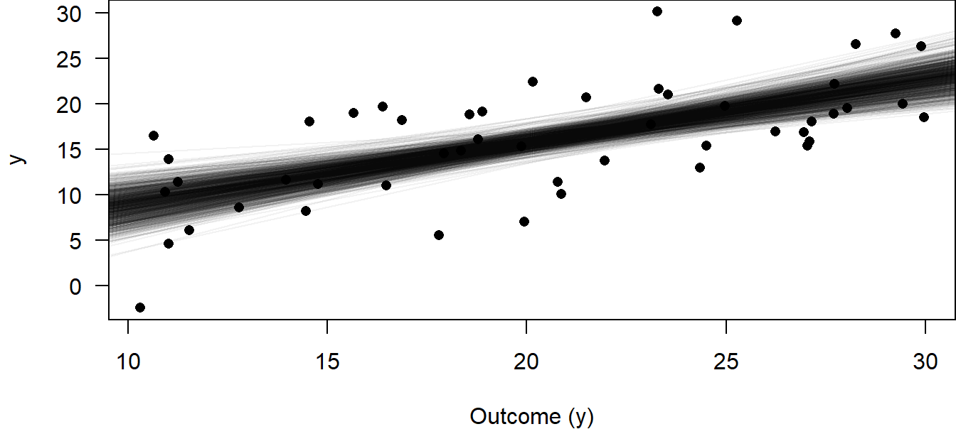
Figure 11.4: 1000 regression lines corresponding to 1000 draws from the joint posterior distribution for the intercept and slope parameters to visualize the uncertainty of the estimated regression line.
A more convenient way to show uncertainty is to plot the 95% compatibility interval, CI, of the regression line. We present a workflow how this can be done using the object returned by sim. When we use rstanarm or brms, the approach can be simplified thanks to cool downstream functions (posterior_epred for rstanarm and brms, or even simpler conditional_effects, only for brms).
The workflow is:
- Create an object “newdat” that contains all the predictor values needed for the intended effectplot
- Create a model matrix from “newdat”
- (Matrix-)Multiply the model matrix with the coefficients and store the result in “fitmat”
- From “fitmat”, we get point estimates and credibility intervals for each line in “newdat”
- Now, “newdat” contains all information needed to make the effectplot
Making these steps is not just an “exercise”, but it also helps understanding the model (and it gives you flexiblity to do things somewhat differently in special circumstances). It involves steps that may seem a bit confusing at first, but really it’s all only addition and multiplication. As said, posterior_epred simplifies the steps (it performs steps 2 and 3), as does conditional_effects (performs steps 1 to 4, and even 5, if you want); these will be discussed in the chapters below.
Using lm + sim, we have to go through all 5 steps. So, we first define new x-values for which we would like to have the fitted values; 100 points across the range of x will produce smooth-looking lines when connected by line segments. We save these 100 new x-values within the tibble newdat. Then, we create a model matrix that contains these new x-values (newmodmat) using the function model.matrix. With this, we can easily calculate the 1000 fitted values for each element of the new x (one value for each of the 1000 simulated regressions, Fig. 11.4, e.g. at x=10, x=10.2, x=10.4, .. x=30), using matrix multiplication (%*%). We save these values in the matrix “fitmat”. Finally, we extract the 2.5% and 97.5% quantiles for each x-value from fitmat, and plot the lines for the lower and upper limits of the compatibility interval (Fig. 11.5).
# Calculate 95% compatibility interval
newdat <- tibble(x = seq(min(dat$x), max(dat$x), length = 100))
newmodmat <- model.matrix( ~ x, data = newdat)
fitmat <- matrix(ncol = nsim, nrow = nrow(newdat))
for(i in 1:nsim) {fitmat[,i] <- newmodmat %*% coef(bsim)[i,]}
newdat$CI_lo <- apply(fitmat, 1, quantile, probs = 0.025)
newdat$CI_up <- apply(fitmat, 1, quantile, probs = 0.975)

# Make plot
regplot <-
  ggplot(dat, aes(x = x, y = y)) +
  geom_point() +
  geom_smooth(method = lm, se = FALSE) +
  geom_line(data = newdat, aes(x = x, y = CI_lo), lty = 3) +
  geom_line(data = newdat, aes(x = x, y = CI_up), lty = 3) +
  labs(x = "Predictor (x)", y = "Outcome (y)")
regplot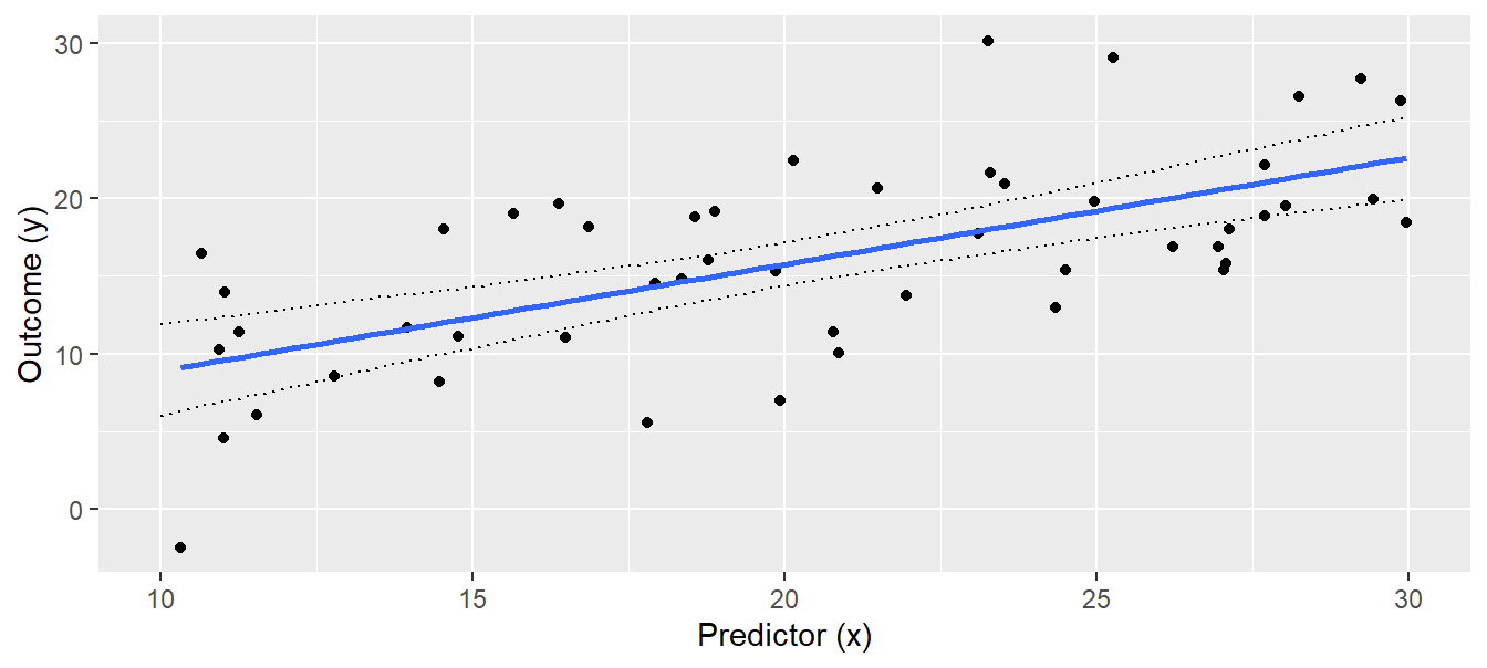
Figure 11.5: Regression with 95% compatibility interval of the posterior distribution of the fitted values.
The interpretation of the 95% compatibility interval is straightforward: We are 95% sure that the true regression line is within the compatibility interval (given the data and the model). As with all statistical results, this interpretation is only valid in the model world (if the world would look like the model).
The compatibility interval measures statistical uncertainty of the regression line. Therefore, the larger the sample size, the narrower the interval, because each additional data point increases information about the true regression line. But the compatibility interval does not describe how new observations would scatter around the regression line. If we want to describe where future observations will be, we have to report the posterior predictive distribution. We can get a sample of random draws from the posterior predictive distribution \(\hat{y}|\boldsymbol{\beta},\sigma^2,\boldsymbol{X}\sim normal( \boldsymbol{X \beta, \sigma^2})\) using the draws from joint posterior distribution of the model parameters, thereby taking the uncertainty of the parameter estimates into account. We draw a new \(\hat{y}\)-value from \(normal( \boldsymbol{X \beta, \sigma^2})\) for each simulated set of model parameters (the 1000 above), again at each of the 100 x-values in newdat. Then, we can visualize the 2.5% and 97.5% quantiles of this distribution for each new x-value.
# increase number of simulation to produce smooth lines of the posterior
# predictive distribution
set.seed(34)
nsim <- 50000
bsim <- sim(mod, n.sim=nsim)
fitmat <- matrix(ncol=nsim, nrow=nrow(newdat))
for(i in 1:nsim) fitmat[,i] <- newmodmat%*%coef(bsim)[i,]

# prepare matrix for simulated new data
newy <- matrix(ncol=nsim, nrow=nrow(newdat))

# for each simulated fitted value, simulate one new y-value
for(i in 1:nsim) {
  newy[,i] <- rnorm(nrow(newdat), mean = fitmat[,i], sd = bsim@sigma[i])
}

# Calculate 2.5% and 97.5% quantiles
newdat$pred_lo <- apply(newy, 1, quantile, probs = 0.025)
newdat$pred_up <- apply(newy, 1, quantile, probs = 0.975)

# Add the posterior predictive distribution to the plot
regplot +
  geom_line(data = newdat, aes(x = x, y = pred_lo), lty = 2) +
  geom_line(data = newdat, aes(x = x, y = pred_up), lty = 2)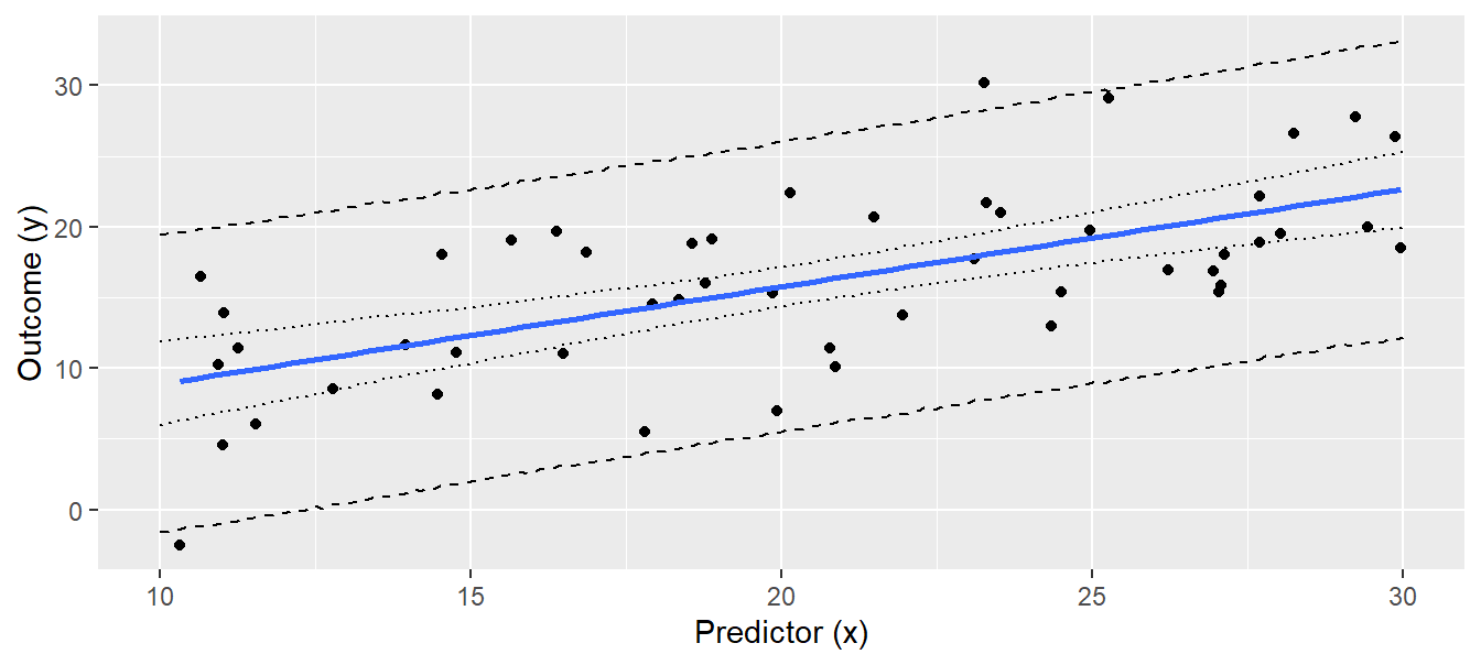
Figure 11.6: Regression line with 95% compatibility interval (dotted lines) and the 95% interval of the posterior predictive distribution (broken lines). Note that we increased the number of draws to produce smooth lines.
Of future observations, 95% are expected to be within the interval defined by the broken lines in Fig. 11.6. Note that increasing the sample size (i.e. more black dots) will not give a narrower predictive distribution, because the predictive distribution depends on the residual variance \(\sigma^2\), which is a property of the data, just like the intercept and the slope, and these are, of course, independent of sample size. The credibility interval, on the other hand, reflects the uncertainty of the regression line, which becomes less as we have more data.
The way we produced Fig. 11.6 is somewhat tedious compared to how easy we could have obtained the same figure using frequentist methods: predict(mod, newdata = newdat, interval = "prediction") would have produced the y-values for the lower and upper lines in Fig. 11.6 in one R-code line. However, once we have draws from the posterior predictive distribution, we have much more information than is contained in the frequentist prediction interval. For example, we could give an estimate for the proportion of observations greater than 20, given \(x = 25\).
# when creating newdat$x, we did not makes sure that 25 is one of the 100 x-values. This could
# be achieved by specifically adding the 25:
# newdat <- tibble(x = sort(c(seq(min(dat$x), max(dat$x), length = 100),25)))
# we did not do that above to not overload the new material. So, now, we simply search for the
# x-value closest to 25 (which is so near 25 that the conclusion is valid)

sum(newy[abs(newdat$x-25) == min(abs(newdat$x-25)), ] > 20) / nsim
## [1] 0.4415Thus, we expect 44% of future observations with \(x = 25\) to be higher than 20. We can extract similar information for any relevant threshold value.
11.1.3.2 Presenting results: from stan_glm
When we use rstanarm to fit our linear regression, we directly get (by default 4000) draws from the (joint) posterior (distribution), i.e. this is comparable to using lm + sim.
Above, we said that we can present results either with numbers (e.g. in a table) or we can make an effectplot. When we fit the model with stan_glm, the applying the print or summary function to the model object returns numbers - but not the 2.5% and 97.5% quantiles. Yet, we can easily get these using as.matrix.
bsim.rstanarm <- as.matrix(mod.rstanarm)
   # bsim.rstanarm: in analogy to the bsim we created above
head(bsim.rstanarm,2)
## parameters
## iterations (Intercept) x sigma
## [1,] 4.789503 0.5238403 5.392711
## [2,] 1.161007 0.7579249 5.325041We see the first two of 4000 (by default) rows. Each column is the marginal posterior distribution of a parameter (intercept, slope and sigma in the case of a simple linear regression). “bism.rstanarm” itself represents the joint posterior distribution. Remember: the first draw for the intercept belongs to the first draw for the slope! The three values per row belong together. There is a non-zero correlation between them, especially between intercept and slope (-0.96 in our case), which shows that we cannot simply mix values from the marginal posterior of the intercept with any values from the marginal posterior of the slope.
In more complex models, there will be many columns in “bsim.rstanarm”, e.g. one for each level of a random factor (which may be many). We therefore often use some coding to get the columns of the fixed effects only. The column names of these effects can e.g. be found using names(coef(mod.rstanarm)). So, we select the columns of “bsim.rstanarm” that have one of these names:
Then, we can get the mean and the compatibility interval per column:
## (Intercept)           x
## 1.9795605 0.6892663## parameters
## (Intercept) x
## 2.5% -2.830808 0.4591576
## 97.5% 6.861581 0.9202802It’s good to have these numbers, but we understand more about our study system when we make an effectplot. We follow the workflow presented above in the context of a model fitted with lm + sim, but we can use the function posterior_epred to simplify the workflow. We still need the “newdat” that we created above, but we get the “fitmat” easily (without having to create the model matrix).
Remember: “newdat” has 100 rows - one for each of 100 values of x, spanning the range from the minimum to the maximum of x. For each of these 100 values, we have the fitted value on each of the lightblue regression lines shown in 11.4 (we now have 4000 such lines by default when using rstanarm). These values are stored in “fitmat.rstanarm”, i.e. it has 100 x 4000 values. For each of the 100 x-values in “newdat”, we have one column in “fitmat.rstanarm” - this is how posterior_epred organizes all these numbers (in the “fitmat” based on sim above, we stored the values per x-value in rows, not columns, but that’s just a convention).
So, we can get the mean and the bounds of the compatibility interval for each of the 100 rows of “newdat” by looking at each of the 100 columns in “fitmat.rstanarm”, just as we did it for “fitmat” above (but, again, there per row, now per column).
newdat.rstanarm <- tibble(x = seq(min(dat$x), max(dat$x), length = 100))  # same as above
newdat.rstanarm$fit <- apply(fitmat.rstanarm,2,mean)
newdat.rstanarm$lwr <- apply(fitmat.rstanarm,2,quantile,probs=0.025)
newdat.rstanarm$upr <- apply(fitmat.rstanarm,2,quantile,probs=0.975)
Now, “newdat.rstanarm” is equivalent to the “newdat” we created above (differences are only due to our “nsim” not being infinity, i.e. due to the so called Monte Carlo error), and we can make the effectplot as we did above.
11.1.3.3 Presenting results: from brm
As with rstanarm, when using brm, we directly get (by default 4000) draws from the (joint) posterior (distribution). As before, we can look at the marginal posterior distributions (of which there is one for each estimated parameter) and calculate the mean and the 95% compatibility interval to report e.g. the slope of the regression line, and we can draw effectplots.
As always in R, we can use more basic or more developed functions / packages to do our task, e.g. to extract the draws for a parameter and to create an effectplot. If you like to dive into specific packages that do all kinds of useful things for you, you should e.g. look into tidy-brms. If you are more a base R type, you can check out what is in str(mod.brm) - you’ll find the 4000 draws somewhere. For now, we follow an intermediate path that is still quite close to base, but we’ll also use the high-level function conditional_effects.
To extract the draws, we use the package posterior and the functions as_draws_matrix to get all draws in the form of a matrix. This includes not only the beta-coefficients (intercept and slope), but also sigma and other, more technical components like the log posterior (termed “lp_”). For now, we are only interested in the beta-coefficients, which we can extract from the draws matrix using subset_draws with variable="b_" and regex=T to get the variables with ”b” in their names (which are the fixed effects parameters).
library(posterior)
bsim.brm.fix <- as_draws_matrix(mod.brm) %>%
  subset_draws(variable="b_",regex=T)

head(bsim.brm.fix)   # in analogy to bsim.rstanarm.fix created above
## # A draws_matrix: 6 iterations, 1 chains, and 2 variables
## variable
## draw b_Intercept b_x
## 1 0.49 0.71
## 2 2.60 0.74
## 3 1.66 0.64
## 4 0.66 0.75
## 5 -3.71 0.96
## 6 1.30 0.75Above, we see the first six of 4000 draws from the joint posterior. We can get the mean per column, which is the point estimate for intercept and slope, and we can get the 2.5% and 97.5% quantiles per column as the 95% credibility interval per parameter. These values can be reported e.g. in a results table.
# we store the values for later use; the outer parentheses make that the result is also printed
( t.fit <- apply(bsim.brm.fix,2,mean) )
## b_Intercept b_x
## 2.0092182 0.6888052## variable
## b_Intercept b_x
## 2.5% -3.123051 0.4452083
## 97.5% 7.139709 0.9279055From these, we can say that we estimate the slope of the regression line to be 0.69 with 95% compatibility interval [0.45; 0.93].
To make an effectplot from a model fitted with brm, wen can use the function conditional_effects. It directly makes an effectplot, but we are more flexible graphically when we store the conditional_effects-object and plot as we please.
##          x        y cond__ effect1__ estimate__     se__  lower__  upper__
## 1 10.31151 16.11107      1  10.31151   9.119244 1.423633 6.298349 11.90075
## 2 10.51009 16.11107      1  10.51009   9.260262 1.397846 6.474818 11.99890
## 3 10.70867 16.11107      1  10.70867   9.399788 1.378275 6.650641 12.10344
## 4 10.90725 16.11107      1  10.90725   9.535972 1.357065 6.834295 12.20645
## 5 11.10583 16.11107      1  11.10583   9.674959 1.332796 7.012285 12.30546
## 6 11.30441 16.11107      1  11.30441   9.813668 1.315574 7.193552 12.39428
We specified in the argument “effects” that we want to have the values for an effectplot for the predictor x. The function generates a list (one for each predictor we want an effectplot of - here only one), and we just want the list element for our x (hence the $x at the end). The code creates, in one row, what we did “by hand” above in the workflow presented to make an effectplot coming from lm + sim, or coming from stan_glm. This workflow (via “newdat”) would also work for brm (using either a model matrix and bsim.brm.fix, or posterior_epred), but conditional_effects only works for brm.
Hence, conditional_effects creates the “newdat” (using 100 x-values from the minimum to the maximum) and, per row, the fitted value (“estimate__“) and the 95% compatibility interval (”lower” to “upper”). We store that into the object we name “newdat.brm” and can use this to make the eftectplot as done above.
11.1.4 Interpretation of the R summary output
The aim of a linear regression is to find the \(\boldsymbol{\beta}\) - the solution to the problem is essentially given by Equation (11.3). Most statistical software, including R, also return an estimated frequentist standard error for each \(\beta_k\). We extract these standard errors together with the estimates for the model parameters using the summary function.
##
## Call:
## lm(formula = y ~ x, data = dat)
##
## Residuals:
##      Min       1Q   Median       3Q      Max
## -11.5777  -3.6280  -0.0532   3.9873  12.1374
##
## Coefficients:
##             Estimate Std. Error t value    Pr(>|t|)
## (Intercept)   2.0050     2.5349   0.791       0.433
## x             0.6880     0.1186   5.800 0.000000507 ***
## ---
## Signif. codes:  0 '***' 0.001 '**' 0.01 '*' 0.05 '.' 0.1 ' ' 1
##
## Residual standard error: 5.049 on 48 degrees of freedom
## Multiple R-squared:  0.412,  Adjusted R-squared:  0.3998
## F-statistic: 33.63 on 1 and 48 DF,  p-value: 0.0000005067
The summary output first gives a rough summary of the residual distribution. However, we will do more rigorous residual analyses in Chapter 12. The estimates of the model coefficients follow. The column “Estimate” contains the estimates for the intercept \(\beta_0\) and the slope \(\beta_1\) . The column “Std. Error” contains the estimated (frequentist) standard errors of the estimates. The last two columns contain the t-value and the p-value of the classical t-test for the null hypothesis that the coefficient equals zero. The last part of the summary output gives the parameter \(\sigma\) of the model, named “residual standard error” and the residual degrees of freedom.
We think the name “residual standard error” for “sigma” is confusing, because \(\sigma\) is not a measurement of uncertainty of a parameter estimate like the standard errors of the model coefficients are. \(\sigma\) is a model parameter that describes how the observations scatter around the fitted values, that is, it is a standard deviation. It is independent of sample size, whereas the standard errors of the estimates for the model parameters will decrease with increasing sample size. Such a standard error of the estimate of \(\sigma\), however, is not given in the summary output. Note that, by using Bayesian methods, we could easily obtain the standard error of the estimated \(\sigma\) by calculating the standard deviation of the posterior distribution of \(\sigma\).
The \(R^2\) and the adjusted \(R^2\) measure the proportion of variance in the outcome variable \(y\) that is explained by the predictors in the model. \(R^2\) is calculated from the sum of squared residuals, \(SSR = \sum_{i=1}^{n}(y_i - \hat{y})\), and the “total sum of squares”, \(SST = \sum_{i=1}^{n}(y_i - \bar{y})\), where \(\bar{y})\) is the mean of \(y\). \(SST\) is a measure of total variance in \(y\) and \(SSR\) is a measure of variance that cannot be explained by the model, thus \(R^2 = 1- \frac{SSR}{SST}\) is a measure of variance that can be explained by the model. If \(SSR\) is close to \(SST\), \(R^2\) is close to zero and the model cannot explain a lot of variance. The smaller \(SSR\), the closer \(R^2\) is to 1. This version of \(R2\) approximates 1 if the number of model parameters approximates sample size even if none of the predictor variables correlates with the outcome. It is exactly 1 when the number of model parameters equals sample size, because \(n\) measurements can be exactly described by \(n\) parameters. The adjusted \(R^2\), \(R^2 = \frac{var(y)-\hat\sigma^2}{var(y)}\) takes sample size \(n\) and the number of model parameters \(k\) into account (see explanation to variance in Chapter 2). Therefore, the adjusted \(R^2\) is recommended as a measurement of the proportion of explained variance.
11.2 Linear model with one categorical predictor (one-way ANOVA)
The aim of analysis of variance (ANOVA) is to compare means of an outcome variable \(y\) between different groups. To do so in the frequentist’s framework, variances between and within the groups are compared using F-tests (hence the name “analysis of variance”). When doing an ANOVA in a Bayesian way, inference is based on the posterior distributions of the group means and the differences between the group means.
One-way ANOVA means that we only have one predictor variable, specifically a categorical predictor variable (in R defined as a “factor”). We illustrate the one-way ANOVA based on an example of simulated data (Fig. 11.7). We have measured weights of 30 virtual individuals for each of 3 groups. Possible research questions could be: How big are the differences between the group means? Are individuals from group 2 heavier than the ones from group 1? Which group mean is higher than 7.5 g?
# settings for the simulation
set.seed(626436)
b0 <- 12        # mean of group 1 (reference group)
sigma <- 2      # residual standard deviation
b1 <- 3         # difference between group 1 and group 2
b2 <- -5        # difference between group 1 and group 3
n <- 90         # sample size

# generate data
group <- factor(rep(c("group 1","group 2", "group 3"), each=30))
simresid <- rnorm(n, mean=0, sd=sigma)  # simulate residuals
y <- b0 +
  as.numeric(group=="group 2") * b1 +
  as.numeric(group=="group 3") * b2 +
  simresid
dat <- tibble(y, group)

# make figure
dat %>%
  ggplot(aes(x = group, y = y)) +
  geom_boxplot(fill = "orange") +
  labs(y = "Weight (g)", x = "") +
  ylim(0, NA)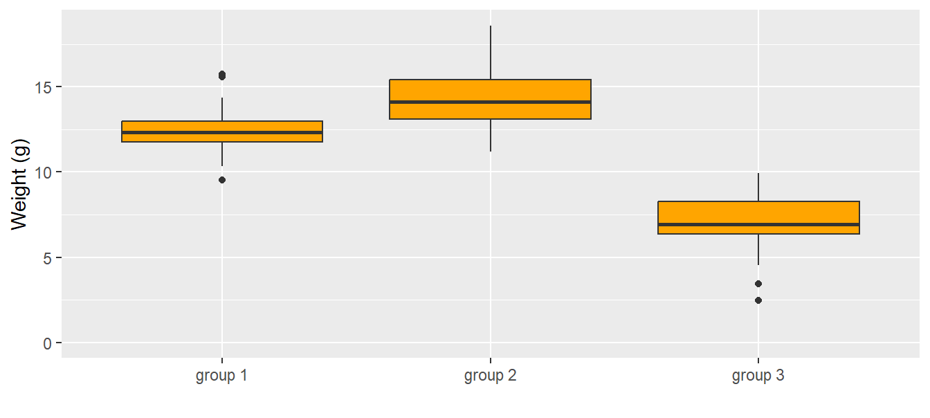
Figure 11.7: Weights (g) of the 30 individuals in each group. The dark horizontal line is the median, the box contains 50% of the observations (i.e., the interquartile range), the whiskers mark the range of all observations that are less than 1.5 times the interquartile range away from the edge of the box.
An ANOVA is a linear regression with a categorical predictor variable instead of a continuous one. The categorical predictor variable with \(k\) levels is (as a default in R) transformed to \(k-1\) indicator variables. An indicator variable is a binary variable containing 0 and 1 where 1 indicates a specific level (a category of the predictor variable). Often, one indicator variable is constructed for every level except for the reference level. In our example, the categorical variable is “group” with the three levels “group 1”, “group 2”, and “group 3” (\(k = 3\)). Group 1 is taken as the reference level (default in R is the first in the alphabeth), and for each of the other two groups an indicator variable is constructed, \(I(group_i = 2)\) and \(I(group_i = 3)\). The function \(I()\) gives out 1, if the expression is true and 0 otherwise. We can write the model as a formula:
\[\begin{align} \mu_i &=\beta_0 + \beta_1 I(group_i=2) + \beta_1 I(group_i=3) \\ y_i &\sim normal(\mu_i, \sigma^2) \tag{11.5} \end{align}\]
where \(y_i\) is the \(i\)-th observation (weight measurement for individual \(i\) in our example), and \(\beta_{0,1,2}\) are the model coefficients. The residual variance is \(\sigma^2\). The model coefficients \(\beta_{0,1,2}\) constitute the deterministic part of the model. From the model formula it follows that the group means, \(m_g\), are:
\[\begin{align} m_1 &=\beta_0 \\ m_2 &=\beta_0 + \beta_1 \\ m_3 &=\beta_0 + \beta_2 \\ \tag{11.6} \end{align}\]
There are other possibilities to describe three group means with three parameters, for example:
\[\begin{align} m_1 &=\beta_1 \\ m_2 &=\beta_2 \\ m_3 &=\beta_3 \\ \tag{11.7} \end{align}\]
In this case, the model formula would be:
\[\begin{align} \mu_i &= \beta_1 I(group_i=1) + \beta_2 I(group_i=2) + \beta_3 I(group_i=3) \\ y_i &\sim Norm(\mu_i, \sigma^2) \tag{11.8} \end{align}\]
The way the group means are calculated within a model is called the parameterization of the model. Different statistical software use different parameterizations. The parameterization used by R by default is the one shown in Equation (11.5). R automatically takes the first level as the reference (the first level is the first one alphabetically unless the user defines a different order for the levels). The mean of the first group (i.e., of the first factor level) is the intercept, \(b_0\) , of the model. The mean of another factor level is obtained by adding, to the intercept, the estimate of the corresponding parameter (which is the difference from the reference group mean).
The parameterization of the model is defined by the model matrix. In the case of a one-way ANOVA, there are as many columns in the model matrix as there are factor levels (i.e., groups); thus there are k factor levels and k model coefficients. Recall from Equation (11.3) that for each observation, the entry in the \(j\)-th column of the model matrix is multiplied by the \(j\)-th element of the model coefficients and the \(k\) products are summed to obtain the fitted values. For a data set with \(n = 5\) observations of which the first two are from group 1, the third from group 2, and the last two from group 3, the model matrix used for the parameterization described in Equation (11.6) and defined in R by the formula ~ group is
\[\begin{align} \boldsymbol{X}= \begin{pmatrix} 1 & 0 & 0 \\ 1 & 0 & 0 \\ 1 & 1 & 0 \\ 1 & 0 & 1 \\ 1 & 0 & 1 \\ \end{pmatrix} \end{align}\]
If parameterization of Equation (11.7) (corresponding R formula: ~ group - 1) were used,
\[\begin{align} \boldsymbol{X}= \begin{pmatrix} 1 & 0 & 0 \\ 1 & 0 & 0 \\ 0 & 1 & 0 \\ 0 & 0 & 1 \\ 0 & 0 & 1 \\ \end{pmatrix} \end{align}\]
To obtain the parameter estimates for model parameterized according to Equation (11.6) we fit the model in R:
##
## Call:
## lm(formula = y ~ group, data = dat)
##
## Coefficients:
##  (Intercept)  groupgroup 2  groupgroup 3
## 12.367 2.215 -5.430## [1] 1.684949The “Intercept” is \(\beta_0\). The other coefficients are named with the factor name (“group”) and the factor level (either “group 2” or “group 3”). These are \(\beta_1\) and \(\beta_2\) , respectively. Before drawing conclusions from an R output we need to examine whether the model assumptions are met, that is, we need to do a residual analysis as described in Chapter 12.
Different questions can be answered using the above ANOVA: What are the group means? What is the difference in the means between group 1 and group 2? What is the difference between the means of the heaviest and lightest group? In a Bayesian framework we can directly assess how strongly the data support the hypothesis that the mean of the group 2 is larger than the mean of group 1. We first simulate from the posterior distribution of the model parameters.
Then we obtain the posterior distributions for the group means according to the parameterization of the model formula (Equation (11.6)).
m.g1 <- coef(bsim)[,1]
m.g2 <- coef(bsim)[,1] + coef(bsim)[,2]
m.g3 <- coef(bsim)[,1] + coef(bsim)[,3]
The histograms of the simulated values from the posterior distributions of the three means are given in Fig. 11.8. The three means are well separated and, based on our data, we are confident that the group means differ. From these simulated posterior distributions we obtain the means and use the 2.5% and 97.5% quantiles as limits of the 95% compatibility intervals (Fig. 11.8, right).
# save simulated values from posterior distribution in  tibble
post <-
  tibble(`group 1` = m.g1, `group 2` = m.g2, `group 3` = m.g3) %>%
  gather("groups", "Group means")

# histograms per group
leftplot <-
  ggplot(post, aes(x = `Group means`, fill = groups)) +
  geom_histogram(aes(y=..density..), binwidth = 0.5, col = "black") +
  labs(y = "Density") +
  theme(legend.position = "top", legend.title = element_blank())

# plot mean and 95%-CI
rightplot <-
  post %>%
  group_by(groups) %>%
  dplyr::summarise(
    mean = mean(`Group means`),
    CI_lo = quantile(`Group means`, probs = 0.025),
    CI_up = quantile(`Group means`, probs = 0.975)) %>%
  ggplot(aes(x = groups, y = mean)) +
  geom_point() +
  geom_errorbar(aes(ymin = CI_lo, ymax = CI_up), width = 0.1) +
  ylim(0, NA) +
  labs(y = "Weight (g)", x ="")

multiplot(leftplot, rightplot, cols = 2)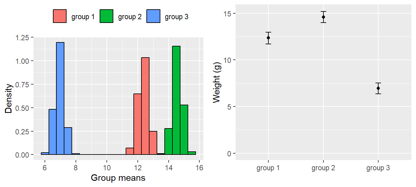
Figure 11.8: Distribution of the simulated values from the posterior distributions of the group means (left); group means with 95% compatibility intervals obtained from the simulated distributions (right).
To obtain the posterior distribution of the difference between the means of group 1 and group 2, we simply calculate this difference for each draw from the joint posterior distribution of the group means.
## [1] -2.209873## 2.5% 97.5%
## -3.128721 -1.348759The estimated difference is -2.2098732. In the small model world, we are 95% sure that the difference between the means of group 1 and 2 is between -3.1287208 and -1.3487594.
How strongly do the data support the hypothesis that the mean of group 2 is larger than the mean of group 1? To answer this question we calculate the proportion of the draws from the joint posterior distribution for which the mean of group 2 is larger than the mean of group 1.
## [1] 1This means that in all of the 1000 simulations from the joint posterior distribution, the mean of group 2 was larger than the mean of group 1. Therefore, there is a very high probability (i.e., it is close to 1; because probabilities are never exactly 1, we write >0.999) that the mean of group 2 is larger than the mean of group 1.
11.3 Other variants of normal linear models
Up to now, we introduced normal linear models with one predictor only. We can add more predictors to the model and these can be numerical or categorical ones. Traditionally, models with 2 or 3 categorical predictors are called two-way or three-way ANOVA, respectively. Models with a mixture of categorical and numerical predictors are called ANCOVA. And models containing only numerical predictors are called multiple regressions. Nowadays, we only use the term “normal linear model” as an umbrella term for all these types of models.
While it is easy to add additional predictors in the R formula of the model, it becomes more difficult to interpret the coefficients of such multi-dimensional models. Two important topics arise with multi-dimensional models, interactions and partial effects. We introduce interactions in this chapter using two examples. The first, is a model including two categorical predictors and the second is a model with one categorical and one numeric predictor. Partial effects are treated thereafter.
11.3.1 Linear model with two categorical predictors (two-way ANOVA)
In the first example, we ask how large are the differences in wing length between age and sex classes of the Coal tit Periparus ater. Wing lengths were measured on 19 coal tit museum skins with known sex and age class.
data(periparusater)
dat <- tibble(periparusater) # give the data a short handy name
dat$age <- recode_factor(dat$age, "4"="adult", "3"="juvenile") # replace EURING code
dat$sex <- recode_factor(dat$sex, "2"="female", "1"="male")    # replace EURING code
To describe differences in wing length between the age classes or between the sexes a normal linear model with two categorical predictors is fitted to the data. The two predictors are specified on the right side of the model formula separated by the “+” sign, which means that the model is an additive combination of the two effects (as opposed to an interaction, see following).
After having seen that the residual distribution does not appear to violate the model assumptions (as assessed with diagnostic residual plots, see Chapter 12), we can draw inferences. We first have a look at the model parameter estimates:
##
## Call:
## lm(formula = wing ~ sex + age, data = dat)
##
## Coefficients:
## (Intercept)      sexmale  agejuvenile
## 61.3784 3.3423 -0.8829## [1] 2.134682R has taken the first level of the factors age and sex (as defined in the data.frame dat) as the reference levels. The intercept is the expected wing length for individuals having the reference level in age and sex, thus adult female. The other two parameters provide estimates of what is to be added to the intercept to get the expected wing length for the other levels. The parameter sexmale is the average difference between females and males. We can conclude that in males have in average a 3.3 mm longer wing than females. Similarly, the parameter agejuvenile measures the differences between the age classes and we can conclude that, in average, juveniles have a 0.9 shorter wing than adults. When we insert the parameter estimates into the model formula, we get the receipt to calculate expected values for each age and sex combination:
\(\hat{y_i} = \hat{\beta_0} + \hat{\beta_1}I(sex=male) + \hat{\beta_2}I(age=juvenile)\) which yields
\(\hat{y_i}\) = 61.4 \(+\) 3.3 \(I(sex=male) +\) -0.9 \(I(age=juvenile)\).
Alternatively, we could use matrix notation. We construct a new data set that contains one virtual individual for each age and sex class.
newdat <- tibble(expand.grid(sex=factor(levels(dat$sex)),
                      age=factor(levels(dat$age))))
# expand.grid creates a data frame with all combination of values given
newdat
## # A tibble: 4 × 2
## sex age
## <fct> <fct>
## 1 female adult
## 2 male adult
## 3 female juvenile
## 4 male juvenilenewdat$fit <- predict(mod, newdata=newdat) # fast way of getting fitted values
# or
Xmat <- model.matrix(~sex+age, data=newdat) # creates a model matrix
newdat$fit <- Xmat %*% coef(mod)For this new data set the model matrix contains four rows (one for each combination of age class and sex) and three columns. The first column contains only ones because the values of this column are multiplied by the intercept (\(\beta_0\)) in the matrix multiplication. The second column contains an indicator variable for males (so only the rows corresponding to males contain a one) and the third column has ones for juveniles.
\[\begin{align} \hat{y} = \boldsymbol{X \hat{\beta}} = \begin{pmatrix} 1 & 0 & 0 \\ 1 & 1 & 0 \\ 1 & 0 & 1 \\ 1 & 1 & 1 \\ \end{pmatrix} \times \begin{pmatrix} 61.4 \\ 3.3 \\ -0.9 \end{pmatrix} = \begin{pmatrix} 61.4 \\ 64.7 \\ 60.5 \\ 63.8 \end{pmatrix} = \boldsymbol{\mu} \tag{11.3} \end{align}\]
The result of the matrix multiplication is a vector containing the expected wing length for adult and juvenile females and adult and juvenile males.
When creating the model matrix with model.matrix care has to be taken that the columns in the model matrix match the parameters in the vector of model coefficients. To achieve that, it is required that the model formula is identical to the model formula of the model (same order of terms!), and that the factors in newdat are identical in their levels and their order as in the data the model was fitted to.
To describe the uncertainty of the fitted values, we use 2000 sets of parameter values of the joint posterior distribution to obtain 2000 values for each of the four fitted values. These are stored in the object “fitmat”. In the end, we extract for every fitted value, i.e., for every row in fitmat, the 2.5% and 97.5% quantiles as the lower and upper limits of the 95% compatibility interval.
nsim <- 2000
bsim <- sim(mod, n.sim=nsim)
fitmat <- matrix(ncol=nsim, nrow=nrow(newdat))
for(i in 1:nsim) fitmat[,i] <- Xmat %*% coef(bsim)[i,]
newdat$lwr <- apply(fitmat, 1, quantile, probs=0.025)
newdat$upr <- apply(fitmat, 1, quantile, probs=0.975)dat$sexage <- factor(paste(dat$sex, dat$age))
newdat$sexage <- factor(paste(newdat$sex, newdat$age))
dat$pch <- 21
dat$pch[dat$sex=="male"] <- 22
dat$col="blue"
dat$col[dat$age=="adult"] <- "orange"
par(mar=c(4,4,0.5,0.5))
plot(wing~jitter(as.numeric(sexage), amount=0.05), data=dat, las=1,
ylab="Wing length (mm)", xlab="Sex and age", xaxt="n", pch=dat$pch,
bg=dat$col, cex.lab=1.2, cex=1, cex.axis=1, xlim=c(0.5, 4.5))
axis(1, at=c(1:4), labels=levels(dat$sexage), cex.axis=1)
segments(as.numeric(newdat$sexage), newdat$lwr, as.numeric(newdat$sexage), newdat$upr, lwd=2,
lend="butt")
points(as.numeric(newdat$sexage), newdat$fit, pch=17)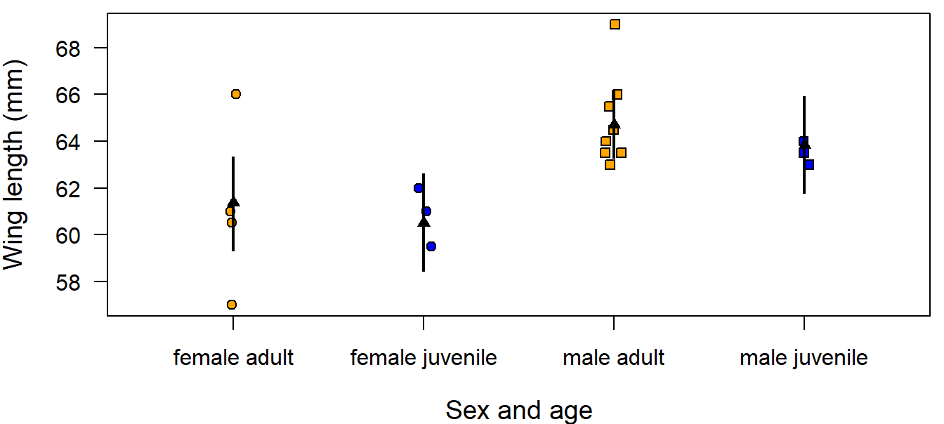
Figure 11.9: Wing length measurements on 19 museumm skins of coal tits per age class and sex. Fitted values are from the additive model (black triangles) and from the model including an interaction (black dots). Vertical bars = 95% compatibility intervals.
We can see that the fitted values are not equal to the arithmetic means of the groups; this is especially clear for juvenile males. The fitted values are constrained because only three parameters were used to estimate four means. In other words, this model assumes that the age difference is equal in both sexes and, vice versa, that the difference between the sexes does not change with age. If the effect of sex changes with age, we would include an interaction between sex and age in the model. Including an interaction adds a fourth parameter enabling us to estimate the group means exactly. In R, an interaction is indicated with the : sign.
mod2 <- lm(wing ~ sex + age + sex:age, data=dat)

# alternative formulations of the same model:
# mod2 <- lm(wing ~ sex * age, data=dat)
# mod2 <- lm(wing ~ (sex + age)^2, data=dat)
The formula for this model is \(\hat{y_i} = \hat{\beta_0} + \hat{\beta_1}I(sex=male) + \hat{\beta_2}I(age=juvenile) + \hat{\beta_3}I(age=juvenile)I(sex=male)\). From this formula we get the following expected values for the sexes and age classes:
for adult females: \(\hat{y} = \beta_0\)
for adult males: \(\hat{y} = \beta_0 + \beta_1\)
for juveniles females: \(\hat{y} = \beta_0 + \beta_2\)
for juveniles males: \(\hat{y} = \beta_0 + \beta_1 + \beta_2 + \beta_3\)
The interaction parameter measures how much different between age classes is the difference between the sexes.
To obtain the fitted values the R-code above can be recycled with two adaptations. First, the model name needs to be changed to “mod2”. Second, importantly, the model matrix needs to be adapted to the new model formula.
newdat$fit2 <- predict(mod2, newdata=newdat)
bsim <- sim(mod2, n.sim=nsim)
Xmat <- model.matrix(~ sex + age + sex:age, data=newdat)
fitmat <- matrix(ncol=nsim, nrow=nrow(newdat))
for(i in 1:nsim) fitmat[,i] <- Xmat %*% coef(bsim)[i,]
newdat$lwr2 <- apply(fitmat, 1, quantile, probs=0.025)
newdat$upr2 <- apply(fitmat, 1, quantile, probs=0.975)
print(newdat[,c(1:5,7:9)], digits=3)
## # A tibble: 4 × 8
## sex age fit[,1] lwr upr fit2 lwr2 upr2
## <fct> <fct> <dbl> <dbl> <dbl> <dbl> <dbl> <dbl>
## 1 female adult 61.4 59.3 63.3 61.1 58.8 63.6
## 2 male adult 64.7 63.3 66.2 64.8 63.3 66.4
## 3 female juvenile 60.5 58.4 62.6 60.8 58.2 63.5
## 4 male juvenile 63.8 61.8 65.9 63.5 60.8 66.2These fitted values are now exactly equal to the arithmetic means of each groups.
##            female     male
## adult    61.12500 64.83333
## juvenile 60.83333 63.50000
We can also see that the uncertainty of the fitted values is larger for the model with an interaction than for the additive model. This is because, in the model including the interaction, an additional parameter has to be estimated based on the same amount of data. Therefore, the information available per parameter is smaller than in the additive model. In the additive model, some information is pooled between the groups by making the assumption that the difference between the sexes does not depend on age.
The degree to which a difference in wing length is ‘important’ depends on the context of the study. Here, for example, we could consider effects of wing length on flight energetics and maneuverability or methodological aspects like measurement error. Mean between-observer difference in wing length measurement is around 0.3 mm (Jenni and Winkler 1989). Therefore, we may consider that the interaction is important because its point estimate is larger than 0.3 mm.
##
## Call:
## lm(formula = wing ~ sex + age + sex:age, data = dat)
##
## Coefficients:
##         (Intercept)              sexmale          agejuvenile
##             61.1250               3.7083              -0.2917
## sexmale:agejuvenile
## -1.0417## [1] 2.18867Further, we think a difference of 1 mm in wing length may be relevant compared to the among-individual variation of which the standard deviation is around 2 mm. Therefore, we report the parameter estimates of the model including the interaction together with their compatibility intervals.
| Parameter | Estimate | lwr | upr |
|---|---|---|---|
| (Intercept) | 61.12 | 58.85 | 63.56 |
| sexmale | 3.71 | 0.87 | 6.55 |
| agejuvenile | -0.29 | -3.93 | 3.36 |
| sexmale:agejuvenile | -1.04 | -5.99 | 3.83 |
From these parameters we obtain the estimated differences in wing length between the sexes for adults of 3.7mm and the posterior probability of the hypotheses that males have an average wing length that is at least 1mm larger compared to females is mean(bsim@coef[,2]>1) which is 0.97. Thus, there is some evidence that adult Coal tit males have substantially larger wings than adult females in these data. However, we do not draw further conclusions on other differences from these data because statistical uncertainty is large due to the low sample size.
11.3.2 A linear model with a categorical and a numeric predictor (ANCOVA)
An analysis of covariance, ANCOVA, is a normal linear model that contains at least one factor and one continuous variable as predictor variables. The continuous variable is also called a covariate, hence the name analysis of covariance. An ANCOVA can be used, for example, when we are interested in how the biomass of grass depends on the distance from the surface of the soil to the ground water in two different species (Alopecurus pratensis, Dactylis glomerata). The two species were grown by Ellenberg (1953) in tanks that showed a gradient in distance from the soil surface to the ground water. The distance from the soil surface to the ground water is used as a covariate (‘water’). We further assume that the species react differently to the water conditions. Therefore, we include an interaction between species and water. The model formula is then
\(\hat{y_i} = \beta_0 + \beta_1I(species=Dg) + \beta_2water_i + \beta_3I(species=Dg)water_i\)
\(y_i \sim normal(\hat{y_i}, \sigma^2)\)
To fit the model, it is important to first check whether the factor is indeed defined as a factor and the continuous variable contains numbers (i.e., numeric or integer values) in the data frame.
data(ellenberg)
index <- is.element(ellenberg$Species, c("Ap", "Dg")) & complete.cases(ellenberg$Yi.g)
dat <- ellenberg[index,c("Water", "Species", "Yi.g")] # select two species
dat <- droplevels(dat)
str(dat)
## 'data.frame': 84 obs. of 3 variables:
## $ Water : int 5 20 35 50 65 80 95 110 125 140 ...
## $ Species: Factor w/ 2 levels "Ap","Dg": 1 1 1 1 1 1 1 1 1 1 ...
## $ Yi.g : num 34.8 28 44.5 24.8 37.5 ...Species is a factor with two levels and Water is an integer variable, so we are fine and we can fit the model
mod <- lm(log(Yi.g) ~ Species + Water + Species:Water, data=dat)
# plot(mod)  # 4 standard residual plots
We log-transform the biomass to make the residuals closer to normally distributed. So, the normal distribution assumption is met well. However, a slight banana shaped relationship exists between the residuals and the fitted values indicating a slight non-linear relationship between biomass and water. Further, residuals showed substantial autocorrelation because the grass biomass was measured in different tanks. Measurements from the same tank were more similar than measurements from different tanks after correcting for the distance to water. Thus, the analysis we have done here suffers from pseudoreplication. We will re-analyze the example data in a more appropriate way in Chapter 13.
Let’s have a look at the model matrix (first and last six rows only).
##    (Intercept) SpeciesDg Water SpeciesDg:Water
## 24           1         0     5               0
## 25           1         0    20               0
## 26           1         0    35               0
## 27           1         0    50               0
## 28           1         0    65               0
## 29 1 0 80 0## (Intercept) SpeciesDg Water SpeciesDg:Water
## 193 1 1 65 65
## 194 1 1 80 80
## 195 1 1 95 95
## 196 1 1 110 110
## 197 1 1 125 125
## 198 1 1 140 140The first column of the model matrix contains only 1s. These are multiplied by the intercept in the matrix multiplication that yields the fitted values. The second column contains the indicator variable for species Dactylis glomerata (Dg). Species Alopecurus pratensis (Ap) is the reference level. The third column contains the values for the covariate. The last column contains the product of the indicator for species Dg and water. This column specifies the interaction between species and water.
The parameters are the intercept, the difference between the species, a slope for water and the interaction parameter.
##
## Call:
## lm(formula = log(Yi.g) ~ Species + Water + Species:Water, data = dat)
##
## Coefficients:
##     (Intercept)        SpeciesDg            Water  SpeciesDg:Water
## 4.33041 -0.23700 -0.01791 0.01894## [1] 0.9001547These four parameters define two regression lines, one for each species (Figure 11.10 Left). For Ap, it is \(\hat{y_i} = \beta_0 + \beta_2water_i\), and for Dg it is \(\hat{y_i} = (\beta_0 + \beta_1) + (\beta_2 + \beta_3)water_i\). Thus, \(\beta_1\) is the difference in the intercept between the species and \(\beta_3\) is the difference in the slope.
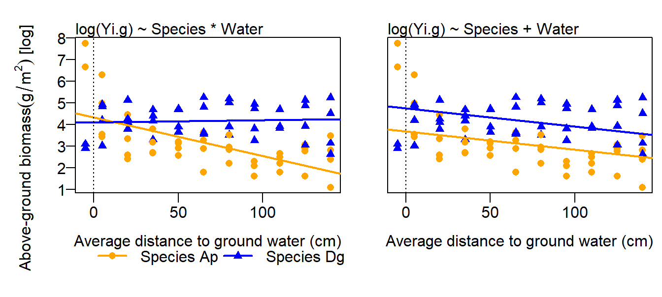
Figure 11.10: Aboveground biomass (g, log-transformed) in relation to distance to ground water and species (two grass species). Fitted values from a model including an interaction species x water (left) and a model without interaction (right) are added. The dotted line indicates water=0.
As a consequence of including an interaction in the model, the interpretation of the main effects become difficult. From the above model output, we read that the intercept of the species Dg is lower than the intercept of the species Ap. However, from a graphical inspection of the data, we would expect that the average biomass of species Dg is higher than the one of species Ap. The estimated main effect of species is counter-intuitive because it is measured where water is zero (i.e, it is the difference in the intercepts and not between the mean biomasses of the species). Therefore, the main effect of species in the above model does not have a biologically meaningful interpretation. We have two possibilities to get a meaningful species effect. First, we could delete the interaction from the model (Figure 11.10 Right). Then the difference in the intercept reflects an average difference between the species. However, the fit for such an additive model is much worth compared to the model with interaction, and an average difference between the species may not make much sense because this difference so much depends on water. Therefore, we prefer to use a model including the interaction and may opt for th second possibility. Second, we could move the location where water equals 0 to the center of the data by transforming, specifically centering, the variable water: \(water.c = water - mean(water)\). When the predictor variable (water) is centered, then the intercept corresponds to the difference in fitted values measured in the center of the data.
For drawing biological conclusions from these data, we refer to Chapter 13, where we use a more appropriate model.
11.4 Partial coefficients and some comments on collinearity
Many biologists think that it is forbidden to include correlated predictor variables in a model. They use variance inflating factors (VIF) to omit some of the variables. However, omitting important variables from the model just because a correlation coefficient exceeds a threshold value can have undesirable effects. Here, we explain why and we present the usefulness and limits of partial coefficients (also called partial correlation or partial effects). We start with an example illustrating the usefulness of partial coefficients and then, give some guidelines on how to deal with collinearity.
As an example, we look at hatching dates of Snowfinches and how these dates relate to the date when snow melt started (first date in the season when a minimum of 5% ground is snow free). A thorough analyses of the data is presented by Schano et al. (2021). An important question is how well can Snowfinches adjust their hatching dates to the snow conditions. For Snowfinches, it is important to raise their nestlings during snow melt. Their nestlings grow faster when they are reared during the snow melt compared to after snow has completely melted, because their parents find nutrient rich insect larvae in the edges of melting snow patches.
load("RData/snowfinch_hatching_date.rda")

# Pearson's correlation coefficient
cor(datsf$elevation, datsf$meltstart, use = "pairwise.complete")
## [1] 0.3274635mod <- lm(meltstart ~ elevation, data=datsf)
100*coef(mod)[2] # change in meltstart with 100m change in elevation## elevation
## 2.97768Hatching dates of Snowfinch broods were inferred from citizen science data from the Alps, where snow melt starts later at higher elevations compared to lower elevations. Thus, the start of snow melt is correlated with elevation (Pearson’s correlation coefficient 0.33). In average, snow starts melting 3 days later with every 100m increase in elevation.
##
## Call:
## lm(formula = hatchday.mean ~ meltstart, data = datsf)
##
## Coefficients:
## (Intercept)    meltstart
##   167.99457      0.06325
From a a normal linear regression of hatching date on the snow melt date, we obtain an estimate of 0.06 days delay in hatching date with one day later snow melt. This effect sizes describes the relationship in the data that were collected along an elevational gradient. Along the elevational gradient there are many factors that change such as average temperature, air pressure or sun radiation. All these factors may have an influence on the birds decision to start breeding. Consequentily, from the raw correlation between hatching dates and start of snow melt we cannot conclude how Snowfinches react to changes in the start of snow melt because the correlation seen in the data may be caused by other factors changing with elevation (such a correlation is called “pseudocorrelation”). However, we are interested in the correlation between hatching date and date of snow melt independent of other factors changing with elevation. In other words, we would like to measure how much in average hatching date delays when snow melt starts one day later while all other factors are kept constant. This is called the partial effect of snow melt date. Therefore, we include elevation as a covariate in the model.
##
## Call:
## lm(formula = hatchday.mean ~ elevation + meltstart, data = datsf)
##
## Coefficients:
## (Intercept)    elevation    meltstart
##  154.383936     0.007079     0.037757
From this model, we obtain an estimate of 0.04 days delay in hatching date with one day later snow melt at a given elevation. That gives a difference in hatching date between early and late years (around one month difference in snow melt date) at a given elevation of 1.13 days (Figure 11.11). We further get an estimate of 0.71 days later hatching date for each 100m shift in elevation. Thus, a 18.75 days later snow melt corresponds to a similar delay in average hatching date when elevation increases by 100m.
When we estimate the coefficient within a constant elevation (coloured regression lines in Figure 11.11), it is lower than the raw correlation and closer to a causal relationship, because it is corrected for elevation. However, in observational studies, we never can be sure whether the partial coefficients can be interpreted as a causal relationship unless we include all factors that influence hatching date. Nevertheless, partial effects give much more insight into a system compared to univariate analyses because we can separated effects of simultaneously acting variables (that we have measured). The result indicates that Snowfinches may not react very sensibly to varying timing of snow melt, whereas at higher elevations they clearly breed later compared to lower elevations.
Figure 11.11: Illustration of the partial coefficient of snow melt date in a model of hatching date. Panel A shows the entire raw data together with the regression lines drawn for three different elevations. The regression lines span the range of snow melt dates occurring at the respective elevation (shown in panel C). Panel B is the same as panel A, but zoomed in to the better see the regression lines and with an additional regression line (in black) from the model that does not take elevation into account.
We have seen that it can be very useful to include more than one predictor variable in a model even if they are correlated with each other. In fact, there is nothing wrong with that. However, correlated predictors (collinearity) make things more complicated.
For example, partial regression lines should not be drawn across the whole range of values of a variable, to avoid extrapolating out of data. At 2800 m asl snow melt never starts in the beginning of March. Therefore, the blue regression line would not make sense for snow melt dates in March.
Further, sometimes correlations among predictors indicate that these predictors measure the same underlying aspect and we are actually interested in the effect of this underlying aspect on our response. For example, we could include also the date of the end of snow melt. Both variables, the start and the end of the snow melt measure the timing of snow melt. Including both as predictor in the model would result in partial coefficients that measure how much hatching date changes when the snow melt starts one day later, while the end date is constant. That interpretation is a mixture of the effect of timing and duration rather than of snow melt timing alone. Similarly, the coefficient of the end of snow melt measures a mixture of duration and timing. Thus, if we include two variables that are correlated because they measure the same aspect (just a little bit differently), we get coefficients that are hard to interpret and may not measure what we actually are interested in. In such a cases, we get easier to interpret model coefficients, if we include just one variable of each aspect that we are interested in, e.g. we could include one timing variable (e.g. start of snow melt) and the duration of snow melt that may or may not be correlated with the start of snow melt.
To summarize, the decision of what to do with correlated predictors primarily relies on the question we are interested in, i.e., what exactly should the partial coefficients be an estimate for.
A further drawback of collinearity is that model fitting can become difficult. When strong correlations are present, model fitting algorithms may fail. If they do not fail, the statistical uncertainty of the estimates often becomes large. This is because the partial coefficient of one variable needs to be estimated for constant values of the other predictors in the model which means that a reduced range of values is available as illustrated in Figure 11.11 C. However, if compatibility intervals are reported alongside the estimates, then using correlated predictors in the same model is absolutely fine, if the fitting algorithm was successful.
The correlations per se can be interesting. Further readings on how to visualize and analyse data with complex correlation structures:
- principal component analysis (Manly 1994)
- path analyses, e.g. Shipley (2009)
- structural equation models (Hoyle 2012)

11.5 Ordered factors and contrasts
In this chapter, we have seen that the model matrix is an \(n \times k\) matrix (with \(n\) = sample size and \(k\) = number of model coefficients) that is multiplied by the vector of the \(k\) model coefficients to obtain the fitted values of a normal linear model. The first column of the model matrix normally contains only ones. This column is multiplied by the intercept. The other columns contain the observed values of the predictor variables if these are numeric variables, or indicator variables (= dummy variables) for factor levels if the predictors are categorical variables (= factors). For categorical variables the model matrix can be constructed in a number of ways. How it is constructed determines how the model coefficients can be interpreted. For example, coefficients could represent differences between means of specific factor levels to the mean of the reference level. That is what we have introduced above. However, they could also represent a linear, quadratic or cubic effect of an ordered factor. Here, we show how this works.
An ordered factor is a categorical variable with levels that have a natural order, for example, ‘low’, ‘medium’ and ‘high’. How do we tell R that a factor is ordered? The swallow data contain a factor ‘nesting_aid’ that contains the type aid provided in a barn for the nesting swallows. The natural order of the levels is none < support (e.g., a wooden stick in the wall that helps support a nest built by the swallow) < artificial_nest < both (support and artificial nest). However, when we read in the data R orders these levels alphabetically rather than according to the logical order.
## [1] "artif_nest" "both" "none" "support"And with the function contrasts we see how R will construct the model matrix.
##            both none support
## artif_nest    0    0       0
## both          1    0       0
## none          0    1       0
## support       0    0       1
R will construct three dummy variables and call them ‘both’, ‘none’, and ‘support’. The variable ‘both’ will have an entry of one when the observation is ‘both’ and zero otherwise. Similarly, the other two dummy variables are indicator variables of the other two levels and ‘artif_nest’ is the reference level. The model coefficients can then be interpreted as the difference between ‘artif_nest’ and each of the other levels. The instruction how to transform a factor into columns of a model matrix is called the contrasts. Now, let’s bring the levels into their natural order and define the factor as an ordered factor.
swallows$nesting_aid <- factor(swallows$nesting_aid, levels=c("none", "support", "artif_nest", "both"), ordered=TRUE)
levels(swallows$nesting_aid)
## [1] "none" "support" "artif_nest" "both"The levels are now in the natural order. R will, from now on, use this order for analyses, tables, and plots, and because we defined the factor to be an ordered factor, R will use polynomial contrasts:
##              .L   .Q         .C
## [1,] -0.6708204  0.5 -0.2236068
## [2,] -0.2236068 -0.5  0.6708204
## [3,]  0.2236068 -0.5 -0.6708204
## [4,]  0.6708204  0.5  0.2236068
When using polynomial contrasts, R will construct three (= number of levels minus one) variables that are called ‘.L’, ‘.Q’, and ‘.C’ for linear, quadratic and cubic effects. The contrast matrix defines which numeric value will be inserted in each of the three corresponding columns in the model matrix for each observation, for example, an observation with ‘support’ in the factor ‘nesting_aid’ will get the values -0.224, -0.5 and 0.671 in the columns L, Q and C of the model matrix. These contrasts define yet another way to get 4 different group means:
\(m1 = \beta_0 – 0.671* \beta_1 + 0.5*\beta_2 - 0.224* \beta_3\)
\(m2 = \beta_0 – 0.224* \beta_1 - 0.5*\beta_2 + 0.671* \beta_3\)
\(m3 = \beta_0 + 0.224* \beta_1 - 0.5*\beta_2 - 0.671* \beta_3\)
\(m4 = \beta_0 + 0.671* \beta_1 + 0.5*\beta_2 + 0.224* \beta_3\)
The group means are the same, independent of whether a factor is defined as ordered or not. The ordering also has no effect on the variance that is explained by the factor ‘nesting_aid’ or the overall model fit. Only the model coefficients and their interpretation depend on whether a factor is defined as ordered or not. When we define a factor as ordered, the coefficients can be interpreted as linear, quadratic, cubic, or higher order polynomial effects. The number of the polynomials will always be the number of factor levels minus one (unless the intercept is omitted from the model in which case it is the number of factor levels). Linear, quadratic, and further polynomial effects normally are more interesting for ordered factors than single differences from a reference level because linear and polynomial trends tell us something about consistent changes in the outcome along the ordered factor levels. Therefore, an ordered factor with k levels is treated like a covariate consisting of the centered level numbers (-1.5, -0.5, 0.5, 1.5 in our case with four levels) and k-1 orthogonal polynomials of this covariate are included in the model. Thus, if we have an ordered factor A with three levels, y~A is equivalent to y~x+I(x^2), with x=-1 for the lowest, x=0 for the middle and x=1 for the highest level.
Note that it is also possible to define own contrasts if we are interested in specific differences or trends. However, it is not trivial to find meaningful and orthogonal (= uncorrelated) contrasts.
11.6 Quadratic and higher polynomial terms
The straight regression line for the biomass of grass species Ap Alopecurus pratensis dependent on the distance to the ground water does not fit well (Figure 11.10). The residuals at low and high values of water tend to be positive and intermediate water levels are associated with negative residuals. This points out a possible violation of the model assumptions.
The problem is that the relationship between distance to water and biomass of species Ap is not linear. In real life, we often find non-linear relationships, but if the shape of the relationship is quadratic (plus, potentially, a few more polynomials) we can still use “linear modeling” (the term “linear” refers to the linear function used to describe the relationship between the outcome and the predictor variables: \(f(x) = \beta_0 + \beta_1x + \beta_2x^2\) is a linear function compared to, e.g., \(f(x) = \beta^x\), which is not a linear function). We simply add the quadratic term of the predictor variable, that is, water in our example, as a further predictor in the linear predictor:
\(\hat{y_i} = \beta_0+\beta_1water_i+\beta_2water_i^2\).
A quadratic term can be fitted in the formula argument of lm using the function I(), which tells R that what is inside I() has to be calculated first. If we do not use I(), the ^2 indicates a two-way interaction. Hence, the model specification is lm(log(Yi.g) ~ Water + I(Water^2), data=...). The cubic term would be added by +I(Water^3).
As with interactions, a polynomial term changes the interpretation of lower level polynomials. Therefore, we normally include all polynomials up to a specific degree. Furthermore, polynomials are normally correlated (if no special transformation is used, see below) which can cause problems when fitting the model (mostly non-convergence). To avoid colinearity among polynomials, so called orthogonal polynomials can be used. These are polynomials that are uncorrelated. To that end, we can use the function poly which creates as many orthogonal polynomials of the variable as we want: poly(dat$Water, 2) creates two columns, the first one can be used to model the linear effect of water, the second one to model the quadratic effect of water:
t.poly <- poly(dat$Water, 2)
dat$Water.l <- t.poly[,1]   # linear term for water
dat$Water.q <- t.poly[,2]   # quadratic term for water
mod <- lm(log(Yi.g) ~ Water.l + Water.q, data=dat)
When orthogonal polynomials are used, the estimated linear and quadratic effects can be interpreted as purely linear and purely quadratic influences of the predictor on the outcome. The function poly applies a specific transformation to the original variables. To reproduce the transformation (e.g. for getting the corresponding orthogonal polynomials for new data used to draw an effectplot), the function predict can be used with the poly-object created based on the original data.
newdat <- data.frame(Water = seq(0,130))
# transformation analogous to the one used to fit the model:
newdat$Water.l <- predict(t.poly, newdat$Water)[,1]
newdat$Water.q <- predict(t.poly, newdat$Water)[,2]
These transformed variables can then be used to calculate fitted values that correspond to the water values specified in the new data.
You can use poly also in the model formula, then no “t.poly” is needed and functions such as posterior_epred and conditional_effects handel the orthogonal polynomials internally. Hence here are the two options:
mod <- lm(log(Yi.g) ~ Species + Water.l + Water.q + Species:Water.l + Species:Water.q, data=dat)
mod <- lm(log(Yi.g) ~ Species + poly(Water,2) + Species:poly(Water,2), data=dat)
The poly-transformation generates rather small numbers (in our case, values are between -0.178 and 0.208), hence their coefficient estimates are often conspicuously large (e.g. in the 100s). If you attach importance to having comparable coefficient estimates (as discussed in Chapter on transformations 5.4), you can z-transform the orthogonal polynomials. But this cannot be done in the model formula, i.e. don’t use scale(poly(Water,2)) - it fits, but it is a different model that will not fit to your data. You can use scale(Water.l), or you prepare everything in the data frame:
dat$Water.l.z <- as.numeric(scale(dat$Water.l))  # the as.numeric is optional but for some rare downstream steps it is
dat$Water.q.z <- as.numeric(scale(dat$Water.q))  #     needed, hence we (or some of us :-)) got used to do it by default
mod <- lm(log(Yi.g) ~ Species + Water.l.z + Water.q.z + Species:Water.l + Species:Water.q, data=dat)
This is, to our knowlegde, the only way to use orthogonal polynomials that produce coefficient estimates that are comparable with those of other covariables. Creating the newdat is a bit tedious, but thanks to copy-paste it is doable (or create your custom function…)
newdat <- data.frame(Water = seq(0,130))
newdat$Water.l <- predict(t.poly, newdat$Water)[,1]   # (same as above)
newdat$Water.q <- predict(t.poly, newdat$Water)[,2]   # (same as above)
newdat$Water.l.z <- (newdat$Water.l - mean(dat$Water.l)) / sd(dat$Water.l)
newdat$Water.q.z <- (newdat$Water.q - mean(dat$Water.q)) / sd(dat$Water.q)
# now, as shown above, create the model matrix and matrix-multiply with the coefficients, or use posterior_epred()
Note: “newdat” now contains $Water.l.z and $Water.q.z for calculating the fitted values, but it also contains $Water which you use for plotting. You get an effectplot on the original scale of $Water, which is much easier to interpret than if you would plot it on the transformed scale.