2 Basics of statistics
This chapter introduces some important terms useful for doing data analyses. We introduce the Bayesian approach of data analyses. We also introduce the essentials of the classical frequentist tests (e.g. t-tests), which can be seen as an alternative to the Bayesian approach. Although we will not be using null hypotheses tests in further chapters of this book (Amrhein, Greenland, and McShane 2019), we introduce them here because we need to understand the scientific literature. For each classical test treated, we provide a suggestion on how to present the statistical results without using null hypothesis tests. We further discuss some differences between the Bayesian and frequentist approaches.
2.1 Variables and observations
Empirical research involves data collection. Data are collected by recording measurements of variables for observational units. An observational unit may be, for example, an individual, a study plot, a time interval or a combination of those. The collection of all units ideally is a random sample of the entire population of units we are interested in. The measurements (or observations) of the random sample are stored in a data table. A data table is a collection of variables (columns). Data tables normally are handled as objects of class data.frame in R. All measurements on a row in a data table belong to the same observational unit. The variables can be of different scales (Table 2.1).
| Scale | Examples | Properties | Coding in R |
|---|---|---|---|
| Nominal | Sex, genotype, habitat | Identity (values have a unique meaning) | factor() |
| Ordinal | Elevational zones | Identity and order (values have an ordered relationship) | ordered() |
| Numeric | Discrete: counts; continuous: body weight, wing length | Identity, order, and interval | intgeger() numeric() |
Nominal and ordinal variables may also be called “categorical” variables.
The aim of many studies is to describe how a variable of interest (\(y\); e.g., the time to build a nest) is related to one or more predictor variables (\(x\); e.g., the sex of the bird, its age class, and the number of individuals in the colony - representing a nominal, ordinal, and numeric predictor). Depending on the author, the y-variable is called “outcome variable”, “response”, or “dependent variable”. The x-variables are called “predictors”, “explanatory variables”, or “independent variables”. We avoid the terms “dependent” and “independent” variables because often we do not know whether the variable \(y\) is in fact depending on the \(x\) variables, and often the x-variables are not independent of each other. In this book, we try to use “outcome” and “predictor” variables because these terms sound most neutral to us as they refer to how the statistical model is constructed rather than to an assumed real relationship.
“Predictors” are often called a “covariable” if they are numeric (e.g. the colony size), and “factor” if they are nominal or ordinal (e.g. sex and age class). Factors always have defined values, called levels (in our example, the factor “sex” has the levels “female” and “male”, and the factor “age class” has the levels “juvenile”, “immature” and “adult”).
2.2 Displaying and summarizing data
2.2.1 Histogram
While nominal and ordinal variables can be summarized by giving the absolute number or the proportion of observations for each level (e.g., number of females and number of males), numeric variables normally are summarized by a location and a scatter statistic, such as the mean and the standard deviation, or the median and some quantiles (see below). Hence, the location tells us around what value our observations lay and it is sometimes called the “measure of central tendency”. The distribution of a numeric variable is graphically displayed in a histogram (Fig. 2.1).
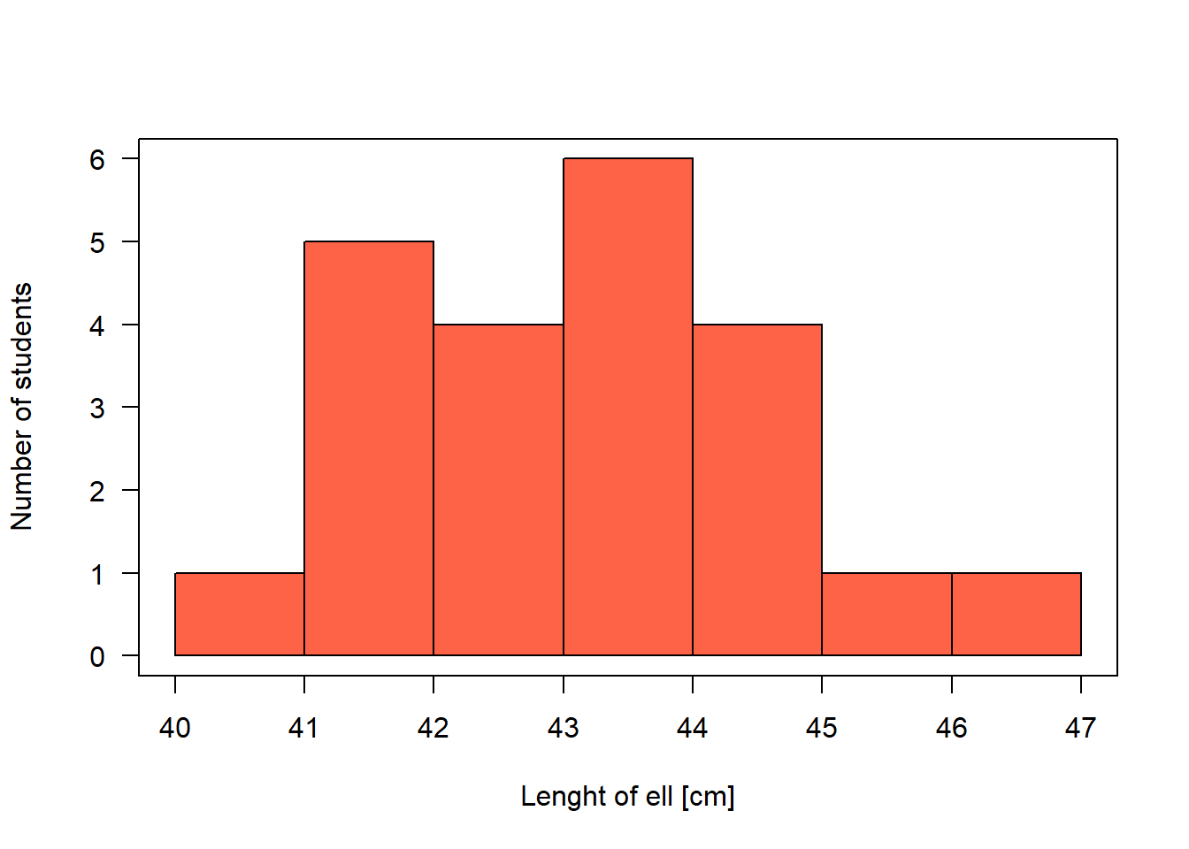
Figure 2.1: Histogram of the length of the forearm of statistics course participants.
Draw a histogram
To draw a histogram, the variable is displayed on the x-axis and the observed values are assigned to classes. We use the function hist. Remember to call the helpfile, if you forget how a function works and which arguments it has; for that, type ?hist in the R console. There, we see that the edges of the classes can be set with the argument breaks=. The values given in the breaks= argument must at least span the values of the variable. If the argument breaks= is not specified, R searches for break-values that make the histogram look smooth. The number of observations in each class is given on the y-axis. The y-axis can be re-scaled so that the area of the histogram equals 1 by setting the argument density=TRUE. In that case, the values on the y-axis correspond to the density values of a probability distribution (Chapter 4). You can also save the result of the hist-function into an object, e.g. t.hist <- hist(dat$ell), possibly with the argument plot=F (F for FALSE). Using t.hist, you may then fully customize your histogram (e.g., overlay two histograms with slightly shifted columns).
2.2.2 Location and scatter {location_and_scatter}
Typical location statistics are mean, median or mode.
There are different types of means, e.g.:
- Arithmetic mean: \(\hat{\mu} = \bar{x} = \frac{1}{n} \sum_{1}^{n}x_i\)
(R function mean), where \(n\) is the sample size. The parameter \(\mu\) is the (unknown) true mean of the entire population of which the \(n\) measurements \(x_i\) are a random sample of. \(\bar{x}\) is called the sample mean and it is used as an estimate for \(\mu\). The \(\hat{}\) (the “hat”) above any parameter indicates that the parameter value is obtained from a sample and, therefore, it may be different from the true value; it is an estimate of the true value.
- Geometric mean: \(\hat{\mu}_{geom} = \bar{x}_{geom} = \sqrt{\prod_{1}^{n}x_i}\)
(no R function in the base package, but you may use: exp(mean(log(x))))
The median is the 50% quantile: 50% of the measurements are below (and, hence, 50% above) the median. If \(x_1,..., x_n\) are the ordered measurements of a variable, then the median is:
- \(\begin{aligned} & Median = \begin{cases} x_{(n+1)/2} & \quad \text{if } n \text{ is odd}\\ \frac{1}{2}(x_{n/2} + x_{n/2+1}) & \quad \text{if } n \text{ is even} \end{cases} \end{aligned}\)
(R function median)
The mode is the value that is occurring with highest frequency or that has the highest density.
Scatter is also called spread, scale, or variance. It describes how far away from the location parameter single observations can be found, or how the measurements are scattered around their mean. The variance is defined as the average squared difference between the observations and the mean:
- Variance \(\hat{\sigma^2} = s^2 = \frac{1}{n-1}\sum_{i=1}^{n}(x_i-\bar{x})^2\)
(R function var). The term \((n-1)\) is called the degrees of freedom. It is used in the denominator of the variance formula instead of \(n\) to prevent underestimating the (true) variance - remember that the \(x_i\) are a sample of the population we are interested in, and \(\hat{\sigma^2}\) is used as an estimate of the true variance \(\sigma^2\) of this population. Because \(\bar{x}\) is in average closer to \(x_i\) than the unknown true mean \(\mu\) would be, the variance would be underestimated if \(n\) is used in the denominator.
The variance is used to compare the degree of scatter among different groups. However, its values are difficult to interpret because of the squared unit. Therefore, the square root of the variance, the standard deviation is normally reported:
- Standard deviation \(\hat{\sigma} = s = \sqrt{s^2}\)
(R Function sd). The standard deviation is approximately the average deviation of an observation from the sample mean. In the case of a normal distribution, about two thirds (68%) of the data are within one standard deviation around the mean, and 95% within two standard deviations (more precisely within 1.96 SD).
Sometimes, the inverse of the variance is used, called precision:
- Precision \(\hat{p} = \frac{1}{\sigma^2}\)
The variance and standard deviation each describe the scatter with a single value. Thus, we have to assume that the observations are scattered symmetrically around their mean in order to get a picture of the distribution of the measurements. When the measurements are spread asymmetrically (skewed distribution), it may be more useful to describe the scatter with more than one value. Such statistics can be quantiles from the lower and upper tail of the data.
Quantiles inform us about the location and spread of a distribution. The \(p\)th-quantile is the value with the property that the proportion \(p\) of all values are less than or equal to the value of the quantile. The median is the 50% quantile. The 25% quantile and the 75% quantiles are also called the lower and upper quartiles, respectively (note the difference between “quantiles” and “quartiles”). The range between the 25% and the 75% quartiles is called the interquartile range. This range includes 50% of the (central part of the) distribution and is also a measure of scatter. The R function quantile extracts sample quantiles. The median, the quartiles, and the interquartile range can be graphically displayed using box-and-whisker plots (boxplots in short, R function boxplot). The horizontal fat bar is the median (Fig. 2.2). The box marks the interquartile range. The whiskers reach out to the last observation within 1.5 times the interquartile range from the quartile. Circles mark observations beyond the whiskers.
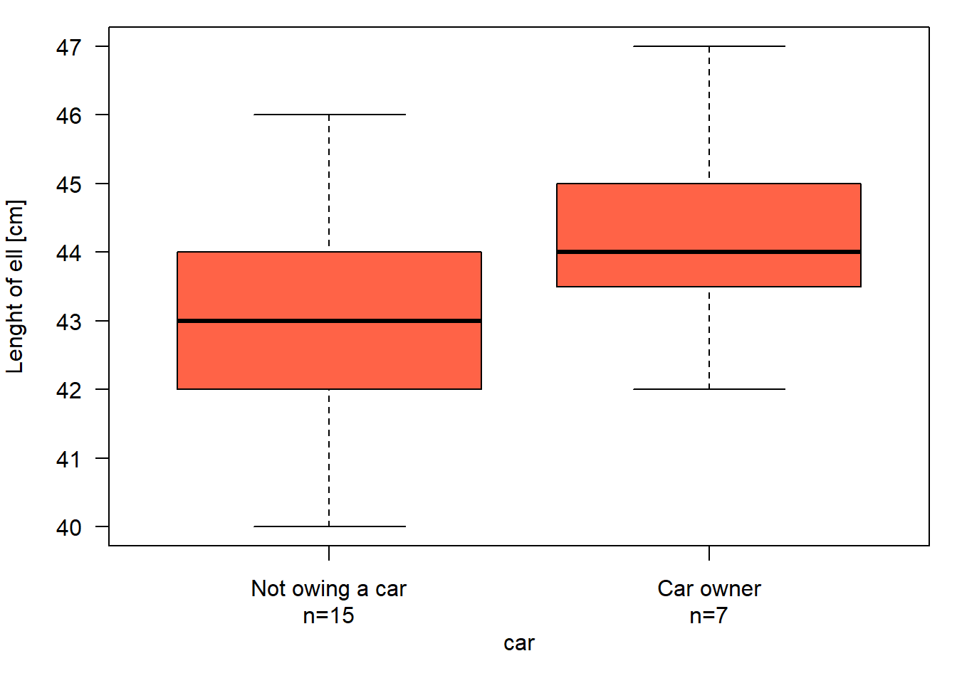
Figure 2.2: Boxplot of the length of forearm of statistics course participants who own car or not.
The boxplot is an appealing tool for comparing location, variance and distribution of measurements among groups.
A value that is far away from the distribution - such that it seems not to belong to the distribution - is called an outlier. It is not always clear whether an observation at the edge of a distribution should be considered an outlier or not, and how to deal with it. The first step is to check whether it could be due to a data entry error. Then, analyses may be done with and without the outlier(s) to see whether they have an effect on our conclusions. If you omit outliers, you must report and justify this. Note that median and interquartile range are less affected by outliers than mean and standard deviation.
To summarize: For symmetric distributions, the mean and standard deviation (SD) describe the distribution of the dataset well, and the mean and median are identical (Fig. 2.3, left). However, in skewed distributions, the mean and median become increasingly different as skewness increases. In these cases, using the mean \(\pm\)1 SD to summarize the data can be misleading (since they suggest symmetry) and the lower bound (i.e., mean - SD) can even fall outside the data (i.e., below the minimum in Fig. 2.3, right). For skewed distributions, median and interquartile range are more informative.
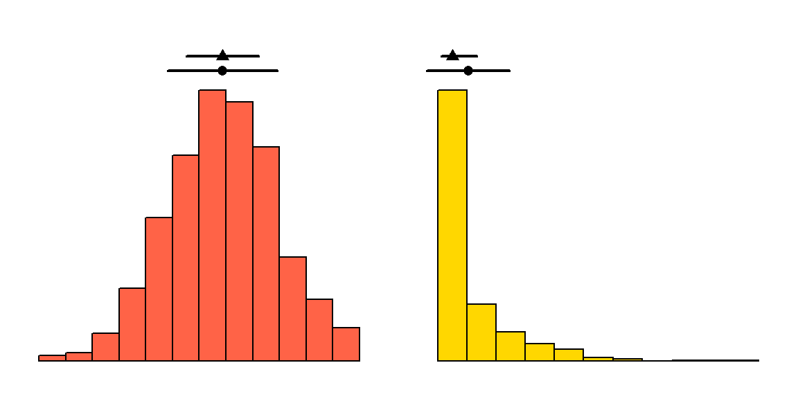
Figure 2.3: A symmetric and a skewed distribution with the corresponding mean (dot, with \(\pm1\) SD) and median (triangle, with interquartile range).
2.2.3 Correlations
A correlation measures the strength with which characteristics of two variables are associated with each other (co-occur). If both variables are numeric, we can visualize the correlation using a scatterplot.
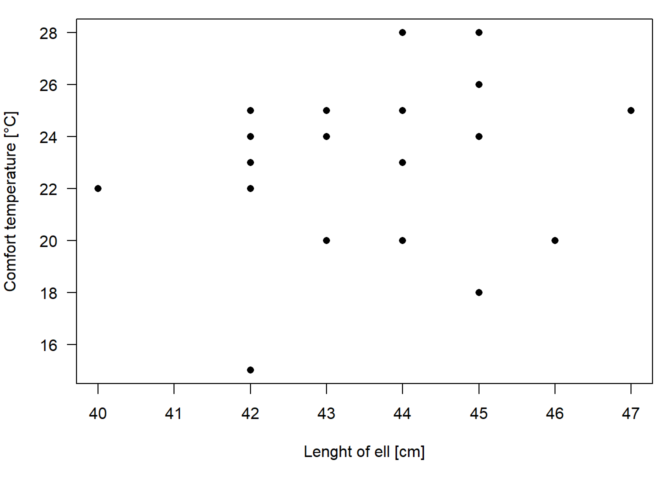
Figure 2.4: Scatterplot of the length of forearm and the comfort temperature of statistics course participants.
The covariance between variable \(x\) and \(y\) is defined as:
- Covariance \(q = \frac{1}{n-1}\sum_{i=1}^{n}((x_i-\bar{x})*(y_i-\bar{y}))\)
(R function cov), with \(\bar{x}\) and \(\bar{y}\) being the means of \(x\) and \(y\). As for the variance, the units of the covariance are sqared and, therefore, covariance values are difficult to interpret. A standardized covariance is the Pearson correlation coefficient:
- Pearson correlation coefficient: \(r=\frac{\sum_{i=1}^{n}(x_i-\bar{x})(y_i-\bar{y})}{\sqrt{\sum_{i=1}^{n}(x_i-\bar{x})^2\sum_{i=1}^{n}(y_i-\bar{y})^2}}\)
(R function cor)
Mean, variance, standard deviation, covariance, and correlation are sensitive to outliers. Single observations with extreme values normally have a disproportionately high influence on these statistics. When outliers are present in the data, we may prefer a more robust correlation measure such as the Spearman correlation or Kendall’s tau. Both are based on the ranks of the measurements instead of the measurements themselves. The rank is simply the rank of each measurement when these are sorted (i.e. the ranks of the measurements 2, 8, 4, 5 are 1, 4, 2, 3). The function rank ranks values, providing different methods to deal with ties, i.e. when two or more measurements are identical (see the helpfile using ?rank).
- Spearman correlation coefficient: correlation between rank(x) and rank(y), i.e. \(r_s=\frac{\sum_{i=1}^{n}(R_{x_i}-\bar{R_x})(R_{y_i}-\bar{R_y})}{\sqrt{\sum_{i=1}^{n}(R_{x_i}-\bar{R_x})^2\sum_{i=1}^{n}(R_{y_i}-\bar{R_y})^2}}\)
(R function cor(x,y, method="spearman")), with \(R_x\) being the rank of observation \(x\) among all \(x\) observations, and \(\bar{R_x}\) the mean of the ranks of \(x\).
- Kendall’s tau: \(\tau = 1-\frac{4I}{(n(n-1))}\), where \(I\) = number of \((i,k)\) for which \((x_i < x_k)\) & \((y_i > y_k)\) or vice versa, and \((i,k)\) has all pairs of observations with \(k>i\).
(R function cor(x,y, method="kendall")). \(I\) counts the number of observation pairs that are “disconcordant”, i.e. where the ranking of the measurements of the two data points is not the same for the both variables. The more discordant pairs in the dataset, the less the correlation.
Figure 2.5 illustrates that the covariance \(q\) is larger with more data points (B vs. A) and with steeper relationships (A vs. C). Pearson correlation \(r\), Spearman correlation \(r_s\) and Kendall’s \(\tau\) are always 1 when dots are in line (A-C), and -1 when the line descends (D), in which case \(q\) is negative, too. The outlier in E has a strong effect on \(r\), but less of an effect on \(r_s\) and \(\tau\). F shows a more real-world example. \(q\) can have any value from \(-\infty\) to \(\infty\), while \(r\), \(r_s\) and \(\tau\) are bound between -1 and 1. If the dots lie on a horizontal line (not shown), \(q\) is 0 and the other three measures of correlation are \(NA\), i.e., not defined.
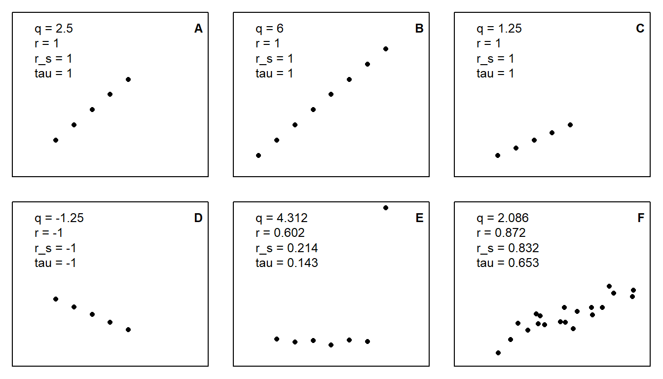
Figure 2.5: Covariance (q), Pearson correlation (r), Spearman correlation (\(r_s\)), and Kendall’s tau (\(\tau\)) for different patterns of x-y-data.
For nominal variables, covariance and the above presented correlations cannot be calculated and would not be meaningful. But still, nominal variables may also be correlated - generally, we talk of “balanced” data if they are uncorrelated and otherwise “unbalanced” data. Measures of two nominal variables can be aggregated in a crosstabulation, e.g., the number of birds observed per combination of sex (male or female) and age (juvenile, immature, or adult). In this table, there are six cells, and if there is the same number of males and females for each age class (and, thereby, also the same number per age class for both sexes), the data is balanced, i.e. sex and age are uncorrelated. The more the six numbers deviate from this, the more unbalanced the data will be regarding sex and age. The \(\chi^2\)-value is a measure of this balancedness, with a value of 0 for perfectly balanced data, and increasingly larger values for less balanced data (also dependent on the size of the crosstabulation).
2.2.4 Principal components analyses PCA
The principal components analysis (PCA) is a multivariate correlation analysis. A multidimensional data set with \(k\) variables (i.e., a multivariate data set) can be seen as a cloud of points (observations) in a \(k\)-dimensional space. Imagine we could move around in the space and look at the cloud from different locations. From some locations, the data looks highly correlated, whereas from others, we cannot see the correlation. That is what PCA is doing. It is rotating the coordinate system (defined by the original variables) so that the correlations are no longer visible. The axes of the new coordinate system are linear combinations of the original variables. They are called principal components. There are as many principal components as there are original variables, i.e., \(k\), \(p_1, ..., p_k\). The principal components must meet further requirements:
- the first component explains the most variance
- the second component explains most of the remaining variance and is perpendicular (= uncorrelated) to the first one
- the third component explains most of the remaining variance and is perpendicular to the first two
- and so on
For example, in a two-dimensional data set \((x_1, x_2)\) the principal components become
\(pc_{1i} = b_{11}x_{1i} + b_{12}x_{2i}\)
\(pc_{2i} = b_{21}x_{1i} + b_{22}x_{2i}\)
with \(b_{jk}\) called the “loading” of the original variable \(k\) on the principal component \(j\). Fig. 2.6 shows the two principal components PC1 and PC2 for a two-dimensional data set. They can be calculated using linear algebra: Principal components are eigenvectors of the covariance or correlation matrix. Note how the data spreads maximally along PC1.
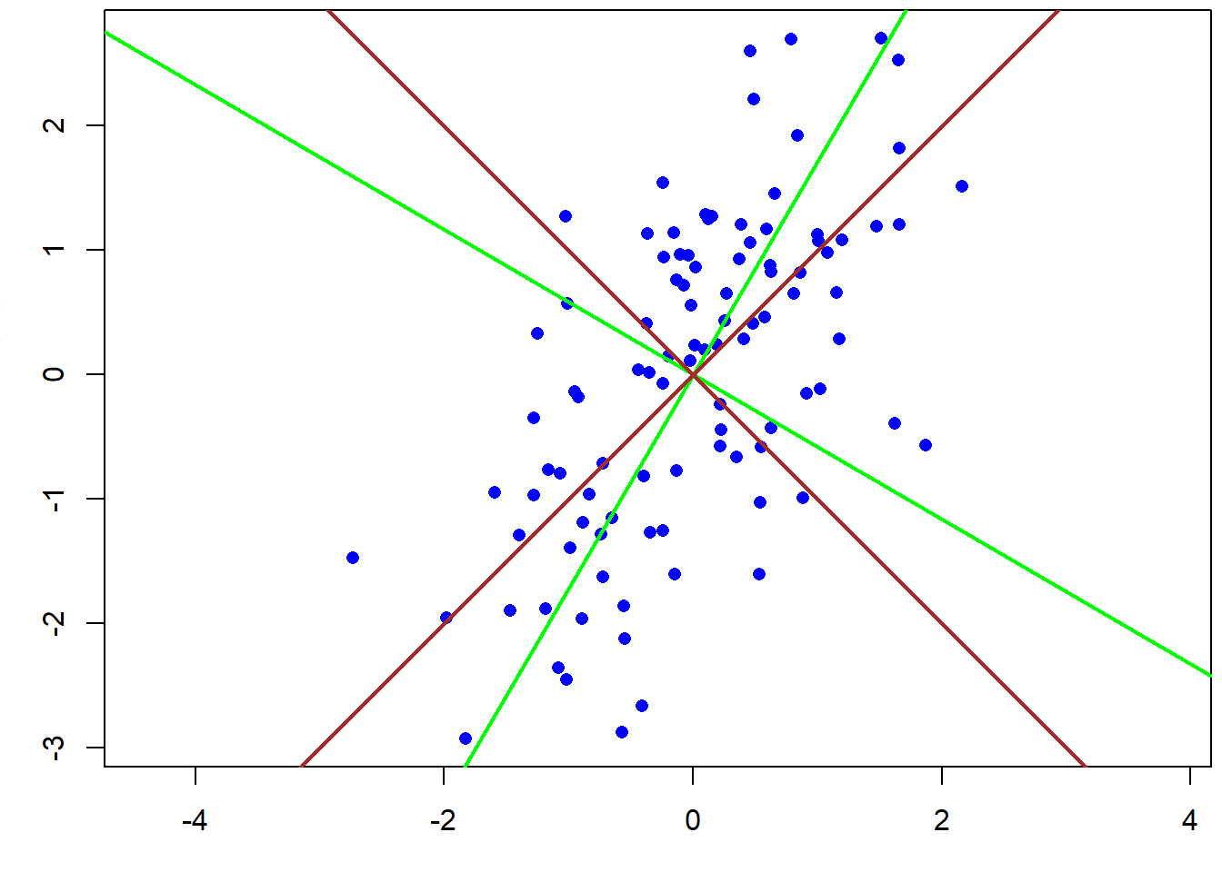
Figure 2.6: Principal components of a two-dimensional data set based on the covariance matrix (green) and the correlation matrix (brown).
The choice between correlation or covariance matrix is important. The covariance matrix is an unstandardized correlation matrix and, therefore, the units (e.g., whether centimeters or meters are used) influence the result of the PCA. A PCA based on the covariance matrix only makes sense when the variances are comparable among the variables, i.e., when all variables are measured in the same unit, and when we want to weigh each variable according to its variance (as defined in @ref(location_and_scatter)). Usually, this is not the case and, therefore, the PCA must be based on the correlation matrix. Note that this is not the default setting in the most commonly used function princomp (use argument cor=TRUE) and prcomp (use argument scale.=TRUE)!
pca <- princomp(cbind(x1,x2)) # PCA based on covariance matrix
pca <- princomp(cbind(x1,x2), cor=TRUE) # PCA based on correlation matrix
loadings(pca)
##
## Loadings:
## Comp.1 Comp.2
## x1 0.707 0.707
## x2 0.707 -0.707
##
## Comp.1 Comp.2
## SS loadings 1.0 1.0
## Proportion Var 0.5 0.5
## Cumulative Var 0.5 1.0The loadings measure the correlation of each variable with the principal components. They describe which aspects of the data each component is measuring. The signs of the loadings are arbitrary, thus we can multiply them by -1 without changing the PCA. Sometimes, this can be handy for describing the meaning of the principal component in a paper. For example, Zbinden et al. (2018) combined the number of hunting licenses, the duration of the hunting period, and the number of black grouse cocks that were allowed to be hunted per hunter in a principal component in order to measure hunting pressure. All three variables had a negative loading on the first component, so that high values of the component meant low hunting pressure. Before the subsequent analyses, for which a measure of hunting pressure was of interest, the authors changed the signs of the loadings so that the first principal component could be used as a measure of hunting pressure.
This example also illustrates what PCA is often used for in ecology: You can reduce the number of predictors (for a model) by combining meaningful sets of predictors into fewer PCs. In the example, three predictors were combined into one predictor. This is often useful when you have many predictors, especially when these contain ecologically meaningful sets of predictors (in the example: hunting pressure variables; could also be weather variables, habitat variables, etc.) and, importantly, when they correlate. If there is no correlation, there is no reason to use PCs instead of the original variables. But if they correlate, the first PC (or the first few PCs) can represent a relevant proportion of the total variance.
Hence, this proportion of variance explained by each PC is, besides the loadings, important information. If the first few components explain the main part of the variance, it means that maybe not all \(k\) variables are necessary to describe the data, or, in other words, the original \(k\) variables contain a lot of redundant information. Then, you can use fewer than \(k\) PCs without losing (much) information.
## Importance of components:
##                           Comp.1    Comp.2
## Standard deviation     1.2679406 0.6263598
## Proportion of Variance 0.8038367 0.1961633
## Cumulative Proportion  0.8038367 1.0000000
Ridge regression is similar to doing a PCA within a linear model, with components with low variance shrunk to a larger degree than components with high variance (may be there will be a chapter on ridge regression some day).
As stated, PCA can be used to generate a lower-dimensional representation of multi-dimensional data, aiming to represent as much of the original multi-dimensional variance as possible in, e.g., two dimensions (PC1 vs. PC2). There are several other techniques, especially from community ecology, with a similar aim, e.g. correspondence analyses (CA), redundancy analyses (RDA), or non-metric multidimensional scaling (NMDS). All these methods, including PCA, belong to the so-called “ordination techniques”. PCA simply turns the data cloud around without any distortion (only scaling), thereby showing as much of the euclidean distance as possible in the first PCs. Other techniques use other distance measures than euclidean. There may be additional variables that constrain the ordination (e.g. constrained = canonical CA). The R package vegan provides many of these ordination techniques and tutorials are available online. You may also start with wikipedia, e.g. on multivariate statistics.
2.3 Inferential statistics
2.3.1 Uncertainty
There is never a “yes-or-no” answer,
there will always be uncertainty
Amrhein (2017)
The decision whether an effect is important or not cannot be based on data alone. For making a decision, we should, beside the data, carefully consider the consequences of each decision, the aims we would like to achieve, and the risk, i.e., how bad it is to make the wrong decision. Decision analyses, often applied in a formal structured decision making (SDM) process, provide methods to combine consequences of decisions, objectives of different stakeholders, and risk attitudes of decision makers to make optimal decisions (Hemming et al. 2022; Runge et al. 2020). In most data analyses, particularly in basic research and when working on case studies, we normally do not consider consequences of decisions. However, the results will be more useful when presented in a way that allows other scientists to use them for a meta-analysis (e.g., within a structured decision making process), allowing stakeholders and politicians to make better decisions. Results useful for this must include information on the size of a parameter of interest, such as the effect of a drug, or an average survival, together with an uncertainty measure.
Therefore, inferential statistics aims to describe the process that presumably has generated the data. It quantifies the uncertainty of the described process that is due data just being a random sample from the larger population we would like to know the process of. In other words: Using regression modelling, we find patterns in our data, and if we make good models and careful ecological reasoning, we can make an educated guess about the underlying process.
Quantification of uncertainty is only possible if:
1. the mechanisms that generated the data are known
2. the observations are a random sample from the population of interest
Most studies aim at understanding the mechanisms that generated the data, thus they are generally not known beforehand. To overcome that problem, we construct models, e.g. statistical models, that are (strong) abstractions of the data generating process. And we report the model assumptions. All uncertainty measures are conditional on the model we used to analyze the data, i.e., they are only reliable if the model describes the data generating process realistically. Because statistical models essentially never describe the data generating process perfectly, the true uncertainty almost always is (much) higher than the one we report.
We can only make inference about the population under study if we have a random sample from this population. To obtain a random sample, a good study design is a prerequisite. To illustrate how inference about a big population is drawn from a small sample, we here use simulated data. The advantage of using simulated data is that the mechanism that generated the data is known, and we can play around with a big population.
Imagine there are 300 000 PhD students in the world and we would like to know how many statistics courses they have taken before they started their PhD on average (Fig. 2.7). We use random number generators (rpois and rgamma) to simulate a number of completed courses for each of the 300 000 virtual students. We use these 300 000 as the big population that in real life we almost never can sample in total. Normally, we only have values for a small sample of students. To simulate that situation we draw 12 numbers at random from the 300 000 (R function sample). Then, we estimate the average number of pre-PhD courses from the sample of 12 students, and we compare that sample mean with the true mean of the 300 000 students.
# simulate the virtual true population
set.seed(235325)   # set seed for random number generator

# simulate fake data of the whole population using an overdispersed Poisson
# distribution, i.e. a Poisson distribution whose mean has a gamma distribution

statscourses <- rpois(300000, rgamma(300000, 2, 3))

# draw a random sample from the population
n <- 12            # sample size
y <- sample(statscourses, 12, replace=FALSE) 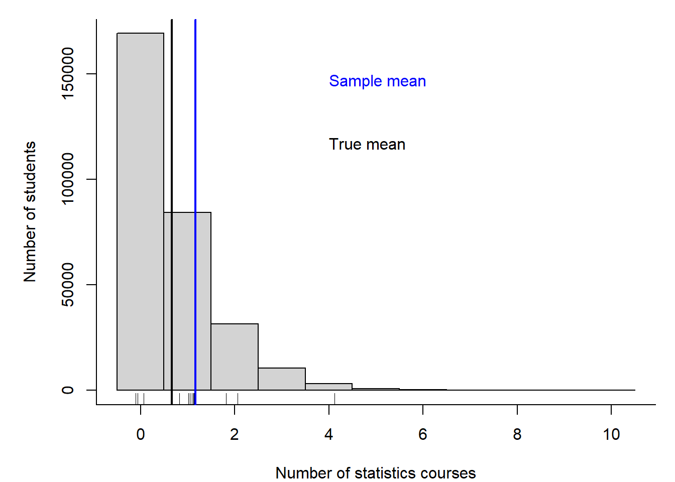
Figure 2.7: Histogram of the number of statistics courses that 300000 virtual PhD students have taken before their PhD started. The rug (small ticks) on the x-axis shows the random sample of 12 drawn from the 300000 students. The black vertical line indicates the mean of the 300000 students (true mean), and the blue line indicates the mean of the sample (sample mean).
We observe the sample mean - but from that, what do we know about the population mean? There are two different approaches to answer this question. 1) We could ask us, how much the sample mean would scatter, if we repeated the study many times? This approach is the basis of frequentist statistics. 2) We could ask us for any possible value, what is the probability that it is the true population mean? To do so, we use probability theory, and that is the basis of Bayesian statistics.
Both approaches use (essentially similar) models. Only the mathematical techniques to calculate uncertainty measures differ between the two approaches. When no information other than the data is used to construct the model, the results are practically identical (at least for large enough sample sizes).
A frequentist 95% confidence interval (CI; blue horizontal segment in Fig. 2.8) is constructed such that, if you were to (hypothetically) repeat the sampling many times, 95% of these many intervals constructed would contain the true value of the parameter (here the mean number of courses). From the Bayesian approach, we get a so-called posterior distribution (pink in Fig. 2.8), from which we can construct a 95% interval (e.g. using the 2.5% and 97.5% quantiles). This interval has traditionally been called 95% credible interval, CrI (see below for other names). It can be interpreted that we are 95% sure that the true mean is inside that interval.
Both confidence interval and posterior distribution represent the statistical uncertainty of the sample mean, i.e., they measure how far away the sample mean could be from the true mean. In this virtual example, we know the true mean is 0.66, thus in the lower part of the 95% CI or in the lower quantiles of the posterior distribution (hence, in the lower part of the 95% CrI). The grey histogram in Fig. 2.8 shows how the means of many different virtual samples of 12 students scatter around the true mean of 0.66. Note that the width of of these many different virtual samples, i.e. of the grey histogram, matches the width of the 95% CI as well as of the posterior distribution of the chosen sample from earlier. In fact, the 95% interval of the grey histogram corresponds to the 95% CI of the chosen sample, and the variance of grey histogram corresponds to the variance of the posterior distribution of the chosen sample. This virtual example illustrates that posterior distribution and 95% CI correctly measure the statistical uncertainty, however we never know exactly how far the sample mean is from the true mean. In real life, we do not know the true mean. Note, again: in frequentist statisics, the statistical uncertainty is represented by the 95% CI, and in Bayesian statistics, the statistical uncertainty is represented by the spread of the posterior distribution, usually quantified giving its 95% interval (95% CrI).
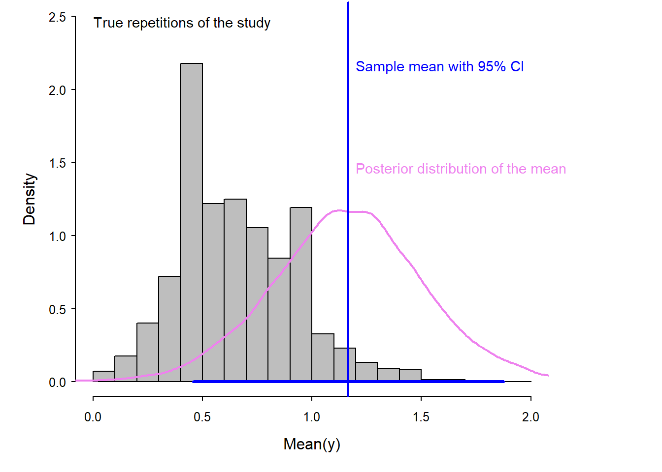
Figure 2.8: Histogram (in gray) of the means of repeated samples from the true population. The scatter of these means visualizes the true uncertainty of the mean in this example. The blue vertical line indicates the mean of one sample. The blue segment shows its 95% confidence interval (obtained by frequentist methods). The violet line shows the posterior distribution of the mean (obtained by Bayesian methods).
Uncertainty intervals are indispensable for drawing inferences from statistical analyses. An estimate without an uncertainty interval, called a point estimate, is quite useless. For example, a point estimate of 10 has a very different meaning if its 95% uncertainty interval spans from -120 to 130 compared to when it spans from 9.6 to 10.4. Therefore, in most cases we provide the point estimate together with its uncertainty interval. But note that this does not guarantee a correct inference: uncertainty intervals, as point estimates, are only reliable if the model is a realistic abstraction of the data generating process (i.e. if the model assumptions are realistic).
Both terms, confidence and credible interval, suggest that the interval indicates confidence or credibility, but the intervals actually show uncertainty. Therefore, it has been suggested to rename the interval into uncertainty interval, or compatibility interval as it indicates the range of values of the parameter (e.g., the mean) that is compatible with the data (Andrew Gelman and Greenland 2019).
2.3.2 Standard error
The standard error, SE, is, besides the uncertainty interval, an alternative possibility to measure uncertainty. It measures an average deviation of the sample mean from the (unknown) true population mean. The frequentist method for obtaining the SE is based on the central limit theorem. According to the central limit theorem, the sum of independent, not necessarily normally distributed random numbers is normally distributed when sample size is large enough (Chapter 4). Because the mean is a sum (divided by a constant, the sample size) it can be assumed that the distribution of the means of many samples is normally distributed. The standard deviation SD of the many means is called the standard error SE. It can be mathematically shown that the standard error SE equals the standard deviation SD of the sample divided by the square root of the sample size:
Frequentist SE = SD/sqrt(n) = \(\frac{\hat{\sigma}}{\sqrt{n}}\)
Bayesian SE = the SD of the posterior distribution
It is very important to keep the difference between SE and SD in mind! SD measures the scatter of the data, whereas SE measures the statistical uncertainty of the mean (or of another estimated parameter, Fig. 2.9). SD is a descriptive statistic, describing a characteristic of the data. The SE, on the other hand, is an inferential statistic; it is a measure of how far away the sample mean may be from the true mean (in Bayesian reasoning, the true mean is expected to be within \(\pm\) 1 SE of the sample mean with a probability of about 67%, and within \(\pm\) 2 SE with 95%). As sample size increases, the SE becomes smaller, whereas SD does not change (on average). The SE becomes smaller because the uncertainty about our sample mean is reduced with increasing sample size. The SD of the sample, however, is an estimate of the SD in the big population, so whether we have a small or large sample, its SD remains the same on average.
Figure 2.9: Illustration of the difference between SD and SE. The SD measures the scatter in the data (sample, tickmarks on the x-axis). The SD is an estimate for the scatter in the big population (grey histogram, normally not known). The SE measures the uncertainty of the sample mean (in blue). The SE measures approximately how far, in average the sample mean (blue) is from the true mean (brown).
2.4 Bayes theorem and the common aim of frequentist and Bayesian methods
2.4.1 Bayes theorem for discrete events
The Bayes theorem describes the probability of event A conditional on event B (the probability of A after B has already occurred) from the probability of B conditional on A and the two probabilities of the events A and B:
\(P(A|B) = \frac{P(B|A)P(A)}{P(B)}\)
Imagine, event A is “the person likes wine as a birthday present” and event B “the person has no car”. The conditional probability of A given B is the probability that a person not owning a car likes wine. Answers from students whether they have a car and what they like as a birthday present are summarized in Table 2.2.
| car/birthday | flowers | wine | sum |
|---|---|---|---|
| no car | 6 | 9 | 15 |
| car | 1 | 6 | 7 |
| sum | 7 | 15 | 22 |
We can apply the Bayes theorem to obtain the probability that the student likes wine given they have no car, \(P(A|B)\). Let’s assume that only the students who prefer wine go to the bar to have a glass of wine after the statistics course. While they drink wine, they tell each other about their cars and they obtain the probability that a student who likes wine has no car, \(P(B|A) = 0.6\). During the statistics class the teacher asked the students about their car ownership and birthday present preference. Therefore, they know that \(P(A) =\) likes wine \(= 0.68\) and \(P(B) =\) no car \(= 0.68\). With this information, they can obtain the probability that a student likes wine given they have no car, even if not all students without cars went to the bar: \(P(A|B) = \frac{0.6*0.68}{0.68} = 0.6\).
2.4.2 Bayes theorem for continuous parameters
When we use the Bayes theorem for analyzing data, the aim is to make probability statements for parameters. Because most parameters are measured along a continuous scale, we use probability density functions to describe what we know about them. From the probability density function, we can calculate the probability for any range of values of the parameter, e.g. the probability that the parameter is larger than 10, or that it is between -2 and 2. The bell-shaped normal distribution is an example of a probability density function (see Chapter 4 for more on probability density functions). Above, we used uppercase \(P\) for the probability of specific events, while in the following, we use the lowercase \(p\) for probability density functions.
The Bayes theorem can be formulated for probability density functions denoted e.g. with \(p(\theta)\) for a parameter \(\theta\). We are interested in the probability of the parameter \(\theta\) given the data, i.e., \(p(\theta|y)\). This probability density function is called the posterior distribution of the parameter \(\theta\). Below, you can see is the Bayes theorem formulated for calculating the posterior distribution of a parameter from the data \(y\), the prior distribution of the parameter, \(p(\theta)\), and assuming a model for the data generating process. This data model is defined by the likelihood, which specifies how the data \(y\) is distributed given the parameters \(p(y|\theta)\):
\(p(\theta|y) = \frac{p(y|\theta)p(\theta)}{p(y)} = \frac{p(y|\theta)p(\theta)}{\int p(y|\theta)p(\theta) d\theta}\)
The probability of the data \(p(y)\) is also called the scaling constant, because it is a constant. It is the integral of the likelihood over all possible values of the parameter(s) of the model.
2.4.3 Estimating a mean assuming that the variance is known
For illustration, we first describe a simple (unrealistic) example for which it is almost possible to follow the mathematical steps for solving the Bayes theorem even for non-mathematicians. Even if we cannot follow all steps, this example will illustrate the principle of how the Bayesian theorem works for continuous parameters. The example is unrealistic because we assume that the variance, \(\sigma^2\), in the data, \(y\), is known. We construct a data model by assuming that \(y\) is normally distributed:
\(p(y|\theta) = normal(\theta, \sigma)\), with \(\sigma\) known. The function \(normal\) defines the probability density function of the normal distribution (Chapter 4).
The parameter for which we would like to get the posterior distribution is \(\theta\), the mean. Remember: the posterior distribution is what we are interested in - it is the result from our analyses - it describs what we know about the mean given our data and the model. First, we have to specify a prior distribution for \(\theta\). For this, we can use the normal distribution. In fact, the normal distribution is a conjugate prior for a normal data model with known variance. Conjugate priors have nice mathematical properties (see Chapter 10) and are, therefore, preferred when the posterior distribution is obtained algebraically (which we only do here for illustrative purposes). Here is our prior: \(p(\theta) = normal(\mu_0, \tau_0)\)
With the above data, data model, and prior, the posterior distribution of the mean, \(\theta\), is defined by: \(p(\theta|y) = normal(\mu_n, \tau_n)\), where \(\mu_n= \frac{\frac{1}{\tau_0^2}\mu_0 + \frac{n}{\sigma^2}\bar{y}}{\frac{1}{\tau_0^2}+\frac{n}{\sigma^2}}\) and \(\frac{1}{\tau_n^2} = \frac{1}{\tau_0^2} + \frac{n}{\sigma^2}\)
\(\bar{y}\) is the arithmetic mean of the data. Because only this value is needed in order to obtain the posterior distribution, this value is called the sufficient statistics.
From the mathematical formulas above, and also from Fig. 2.10, we see that the mean of the posterior distribution is a weighted average between the prior mean and \(\bar{y}\) with weights equal to the precisions (\(\frac{1}{\tau_0^2}\) and \(\frac{n}{\sigma^2}\)).
Figure 2.10: Hypothetical example showing the result of applying the Bayes theorem for obtaining a posterior distribution of a continuous parameter. The likelihood is defined by the data and the model, the prior is expressing the knowledge about the parameter before looking at the data. Combining the two distributions using the Bayes theorem results in the posterior distribution.
2.4.4 Estimating the mean and the variance
We now move to a more realistic example, which is estimating the mean and the variance of a sample of weights of Snowfinches Montifringilla nivalis (Fig. 2.11). To analyze those data, a model with two parameters, the mean and the variance (or the standard deviation) is needed. The data model (or likelihood) is specified as \(p(y|\theta, \sigma) = normal(\theta, \sigma)\).

Figure 2.11: Snowfinches stay above the tree line for winter. They come to feeders.
Because there are two parameters, we need to specify a two-dimensional prior distribution. We looked up in A. Gelman et al. (2014) that the conjugate prior distribution in our case is a Normal-Inverse-Chisquare distribution:
\(p(\theta, \sigma) = N-Inv-\chi^2(\mu_0, \sigma_0^2/\kappa_0; v_0, \sigma_0^2)\)
From the same reference we looked up what the posterior distribution looks like in our case:
\(p(\theta,\sigma|y) = \frac{p(y|\theta, \sigma)p(\theta, \sigma)}{p(y)} = N-Inv-\chi^2(\mu_n, \sigma_n^2/\kappa_n; v_n, \sigma_n^2)\), with
\(\mu_n= \frac{\kappa_0}{\kappa_0+n}\mu_0 + \frac{n}{\kappa_0+n}\bar{y}\),
\(\kappa_n = \kappa_0+n\), \(v_n = v_0 +n\),
\(v_n\sigma_n^2=v_0\sigma_0^2+(n-1)s^2+\frac{\kappa_0n}{\kappa_0+n}(\bar{y}-\mu_0)^2\)
For this example, we need the arithmetic mean \(\bar{y}\) and standard deviation \(s^2\) of the sample to calculate the posterior distribution. Therefore, these two statistics are the sufficient statistics.
The above formula looks intimidating, but we never really do these calculations. We let R do that for us in most cases by drawing many values from the posterior distribution, e.g., using the function sim from the package arm (Andrew Gelman and Hill 2007). In the end, we can visualize the distribution of the many values to have a look at the posterior distribution.
In Fig. 2.12, the two-dimensional \((\theta, \sigma)\) posterior distribution is visualized by using simulated values. The two-dimensional distribution is called the “joint posterior distribution” (a multi-dimensional distribution, showing the distribution of all parameters, in our case \(\theta\) and \(\sigma\)). The mountain of dots in Fig. 2.12 visualizes the Normal-Inverse-Chisquare that we calculated above. When all values of one parameter are displayed in a histogram, ignoring the values of the other parameters, it is called the marginal posterior distribution. Algebraically, the marginal distribution is obtained by integrating out one of the parameters with respect to the joint posterior distribution. This step is definitely much easier when values drawn from the posterior distribution are available (as will be done for all applied cases in the reminder of the book)!
Figure 2.12: Visualization of the joint posterior distribution for the mean and standard deviation of Snowfinch weights. The lower left panel shows the two-dimensional joint posterior distribution, whereas the upper and right panel show the marginal posterior distributions of each parameter separately.
To report statistical uncertainty, e.g. in a scientific paper, we usually report the marginal posterior distributions of every parameter in the model.
In our example, the marginal distribution of the mean is a t-distribution (Chapter 4). Frequentist statistical methods also use a t-distribution to describe the uncertainty of an estimated mean for the case when the variance is not known. Thus, in this example, frequentist methods lead to to the same solution as the Bayesian method, even though a completely different approach and different techniques are used. Doesn’t that dramatically increase our trust in statistical methods?
2.5 Classical frequentist tests and alternatives
2.5.1 Null hypothesis testing
Null hypothesis testing is constructing a model that describes how the data would look given the null hypothesis, i.e., given that there is no effect (e.g., no difference between the means of two groups, or a regression slope of 0). Then, the real data is compared to how the model thinks the data should look like (given no effect = given the null hypothesis). If the data does not look like the null model thinks, we reject the null model (i.e., we reject the null hypothesis) and accept that there seems to be a real effect.
To decide whether the observed data looks like data generated from the null model, the p-value is used. The p-value is the probability of observing the observed, or a more extreme, effect, given the null hypothesis is true. A small p-value indicates that it is unlikely to observe an effect as large (or more extreme) as the effect seen in the data, given the null hypothesis \(H_0\) is true.
Null hypothesis testing is problematic. In the following subchapters, we discuss some of the problems, after having introduced the most commonly used classical tests.
2.5.2 Comparison of a sample with a fixed value (one-sample t-test)
In some studies, we would like to compare the data to a theoretical value. The theoretical value is a fixed value, e.g., calculated based on physical, biochemical, ecological or any other theory. The statistical task is then to compare the mean of the data, including its uncertainty, with the theoretical value. The result of such a comparison may be an estimate of the mean of the data, including its uncertainty. Or, it can be an estimate of the difference of the mean of the data to the theoretical value, including the uncertainty of this difference.
For example, we could have a null hypothesis \(H_0:\)“The mean Snowfinch weight is 40 g”. Given this null hypothesis, we assume that the data can be described by a normal distribution with a mean of \(\mu=40\) and a variance equal to the variance estimated from the data \(\sigma^2\). Given the null hypothesis and the data, it is possible to calculate the distribution of hypothetical means of many different hypothetical samples of sample size \(n\) (under the null hypothesis). The result is a t-distribution (Fig. 2.13). Then, the sample mean is compared to this t-distribution. For this, a standardized difference between the mean and the hypothetical mean under the null hypothesis (here 40 g) is calculated, called the test statistic \(t = \frac{\bar{y}-\mu_0}{\frac{s}{\sqrt{n}}}\), and this is compared to the t-distribution standardized so that its variance is one and centered so that its mean is zero. If the test statistic falls well within the expected distribution (the standardized and centered t-distribution), the null hypothesis cannot be rejected. This means, the data is compatible with the null hypothesis. However, if the test statistic is in the tails of the distribution, the null hypothesis is rejected and we could write that the mean weight of Snowfinches is statistically significantly different from 40 g. Unfortunately, we cannot infer about the probability of the null hypothesis and how relevant the result is.
Figure 2.13: Illustration of a one-sample t-test. The blue histogram shows the distribution of the measured Snowfinch weights. The sample mean is indicated as a lightblue vertical line. The black line is the t-distribution that shows how hypothetical sample means are expected to be distributed if the entire population of Snowfinches has a mean weight of 40 g (as assumed by the null hypothesis). The orange area shows the area of the t-distribution that lays equal or farther away from 40 g than the sample mean. The orange area reflects the p-value.
We can use the r-function t.test to calculate the p-value of a one sample t-test.
##
##  One Sample t-test
##
## data:  y
## t = 3.0951, df = 7, p-value = 0.01744
## alternative hypothesis: true mean is not equal to 40
## 95 percent confidence interval:
##  40.89979 46.72521
## sample estimates:
## mean of x
##   43.8125
The output of the r-function t.test includes the mean and the 95% confidence interval, CI, of the mean. The CI could, alternatively, be obtained as the 2.5% and 97.5% quantiles of a t-distribution with a mean equal to the sample mean, degrees of freedom equal to the sample size minus one, and a standard deviation equal to the standard error of the mean.
## [1] 40.89979## [1] 46.72521When applying the Bayes theorem for obtaining the posterior distribution of the mean, we end up with the same t-distribution as described above (if we use flat prior distributions for the mean and the standard deviation). Thus, the two different approaches end up with the same result!
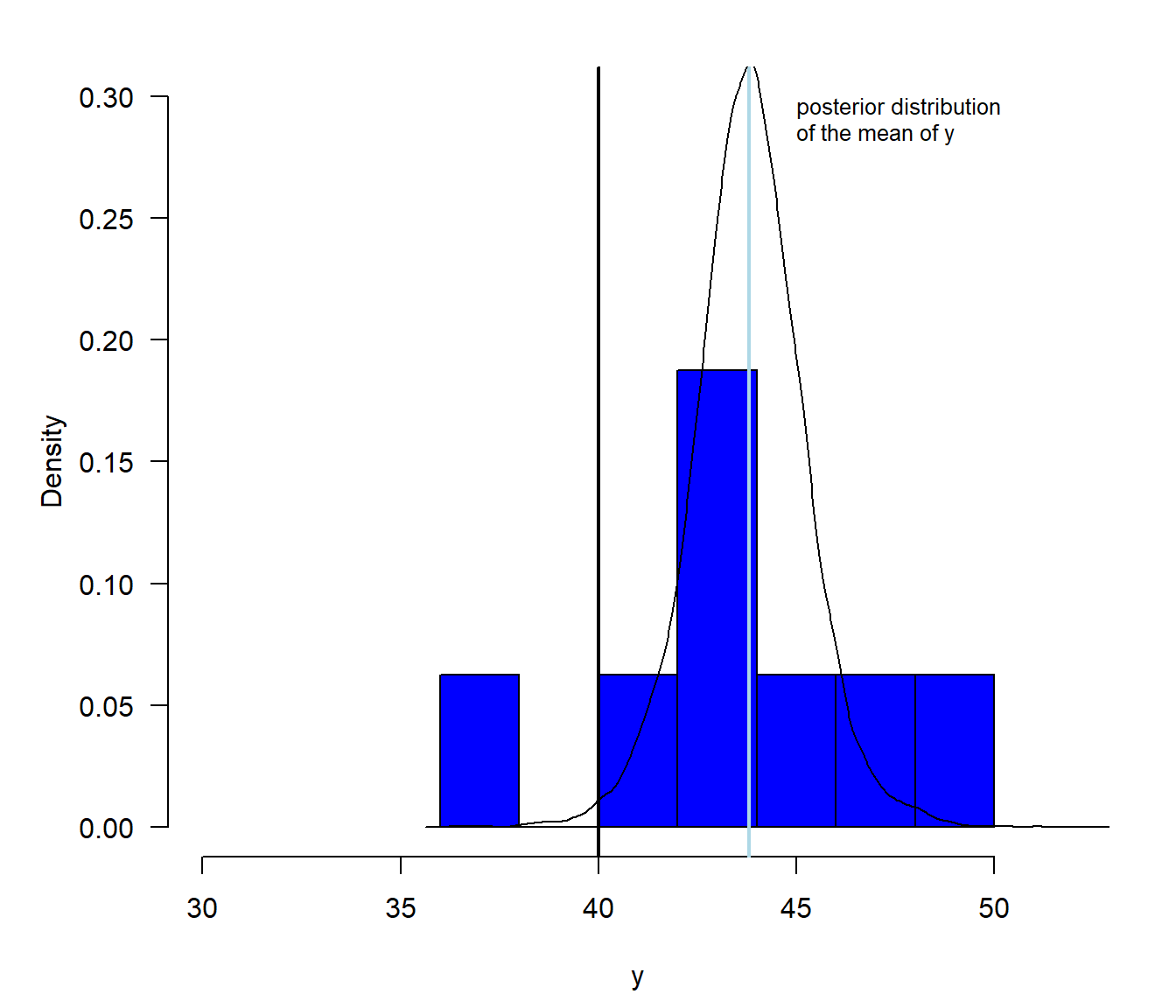
Figure 2.14: Illustration of the posterior distribution of the mean. The blue histogram shows the distribution of the measured weights, with the sample mean (lightblue) indicated as a vertical line. The black line is the posterior distribution, which shows what we know about the mean after having looked at the data. The area under the posterior density function that is larger than 40 is the posterior probability of the hypothesis that the true mean Snowfinch weight is larger than 40 g.
The posterior probability of the hypothesis that the true mean Snowfinch weight is larger than 40 g, \(P(H:\mu>40)\), is equal to the proportion of values drawn from the posterior distribution (saved in the vector bsim@coef from Chapter 2.4.4) that are larger than 40.
# Two ways of calculating the proportion of values
# larger than a specific value within a vector of values
round(sum(bsim@coef[,1]>40)/nrow(bsim@coef),2)
## [1] 0.99## [1] 0.99# Note: logical values TRUE and FALSE become
# the numeric values 1 and 0 within the functions sum() and mean()Thus, we can be pretty sure that the mean Snowfinch weight (in the entire population) is larger than 40 g. Such a conclusion is not very informative, because it does not tell us how much larger we expect the mean weight of the Snowfinch to be. Therefore, we prefer reporting a compatibility interval (or credible interval or uncertainty interval) that tells us what values for the mean Snowfinch weight are compatible with the data (given that our data model realistically reflects the real world). Based on such an interval, we can conclude that we are pretty sure that the mean Snowfinch weight is between 40 and 48 g.
# 80% credible interval, compatibility interval, uncertainty interval
quantile(bsim@coef[,1], probs=c(0.1, 0.9))
## 10% 90%
## 42.08254 45.56718# 95% credible interval, compatibility interval, uncertainty interval
quantile(bsim@coef[,1], probs=c(0.025, 0.975))## 2.5% 97.5%
## 40.86945 46.76137# 99% credible interval, compatibility interval, uncertainty interval
quantile(bsim@coef[,1], probs=c(0.005, 0.995))## 0.5% 99.5%
## 39.41786 48.104402.5.3 Comparison of the locations between two groups (two-sample t-test)
Many research questions aim at measuring differences between groups. For example, we could be curious to know how different in size car owners are from people not owning a car. Hence, we measured the ell (distance from the elbow to the fingertips) for peple with and without a car.
A boxplot is a nice way to visualize ell length measurements of two (or more) groups (Fig. 2.15). From the boxplot, we do not see how many observations are in the two samples, hence we add that information to the plot. The boxplot visualizes the raw data, but it does not show what we know about the mean (per group) in the entire (unmeasured) population - well, we have the median, so we do have some idea about the mean in the entire population (unless the data is very asymmetric), but the box plot does not show the uncertainty of the mean (nor of the median) of the entire population. To show what we know about the mean of the entire population, we calculate, for each group, the mean and its compatibility interval (or uncertainty interval, credible interval, or confidence interval; in brown in Fig. 2.15).
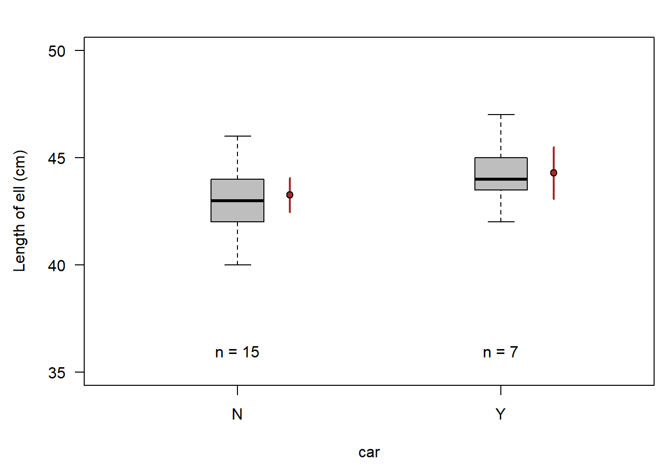
Figure 2.15: Ell length of car owners (Y) and people not owning a car (N). Horizontal bar = median, box = interquartile range, whiskers = most extreme observation within 1.5 times the interquartile range from the quartile, circles = observations farther than 1.5 times the interquartile range from the quartile. Filled brown circle = mean, vertical brown bar = 95% compatibility interval.
When we added the two means with their compatibility intervals, we see what we know about the two means, but we still do not see what we know about the difference between the two means. The uncertainties of the means do not show the uncertainty of the difference between the means. To do so, we need to extract the difference between the two means from a model that describes (abstractly) how the data has been generated. Such a model is a linear model that we will introduce in Chapter 11. In such a model, we have an intercept parameter, which is the estimate of the mean in group one. The second parameter in the model measures the difference in the means of the two groups. From the values drawn from the posterior distribution we can easily extract a 95% compatibility interval for the intercept and for the difference in the group means.
Thus, from our data, we can conclude that the average ell length of car owners is with high probability between 0.5 cm smaller and 2.5 cm larger than the average ell length of people not having a car.
##
## Call:
## lm(formula = ell ~ car, data = dat)
##
## Coefficients:
## (Intercept)         carY
## 43.267 1.019## 2.5% 50% 97.5%
## -0.479615 1.006546 2.507964The corresponding two-sample t-test gives a p-value for the null hypothesis “The difference between the two means equals zero”. The output also includes a confidence interval for the difference, as well as the two means. While the function lm gives the difference Y (yes) minus N (no car), the function t.test gives the difference N minus Y. Luckily the two means are also given in the output, so we know which group mean is the larger one.
##
##  Two Sample t-test
##
## data:  ell by car
## t = -1.4317, df = 20, p-value = 0.1677
## alternative hypothesis: true difference in means between group N and group Y is not equal to 0
## 95 percent confidence interval:
##  -2.5038207  0.4657255
## sample estimates:
## mean in group N mean in group Y
##        43.26667        44.28571
In both approaches we used above to compare the to means - the Bayesian posterior distribution of the difference, and the t-test for the difference - we used a data model. Thereby, we assumed that the ell lengths are normally distributed (within each group in the entire population). Depending on the data, such an assumption may not be valid, and the result will not be reliable. In such cases, we can either search for a more realistic model, or use non-parametric (also called distribution free) methods. Nowadays, we have many options to construct data models (e.g., generalized linear models and beyond). Therefore, we normally look for a model that fits the data sufficiently good. However, in former days, all these possibilities did not exist (or were not easily available for non-mathematicians). Therefore, we here introduce two such non-parametric methods: the Wilcoxon test (or Mann-Whitney U test), and the randomisation test.
Some of the distribution free statistical methods are based on the rank (explained in Chapter 2.2.3) instead of the value of the observations. The principle of the Wilcoxon test is to rank the observations and sum the ranks per group. Although non-parametric methods are often treated as though they don’t have a model, this is not perfectly accurate. The model of the Wilcoxon-test “knows” how the difference in the summed ranks between two groups is distributed given the mean of the two groups do not differ (null hypothesis). Therefore, it is possible to get a p-value, e.g., by using the function wilcox.test.
##
##  Wilcoxon rank sum test with continuity correction
##
## data:  ell by car
## W = 34.5, p-value = 0.2075
## alternative hypothesis: true location shift is not equal to 0
Ranking is ambiguous when equal values, called “ties”, are present (in the ell values). Then, the function output contains a note of caution that no exact p-value can be computed.
The result of the Wilcoxon-test tells us how probable it is to observe the difference in the rank sum between the two samples, or a more extreme difference, given that the means of the two groups are equal. That is at least something.
A similar result is obtained by using a randomisation test. This test is not based on ranks but on the observed values. The aim of the randomisation is to simulate a distribution of the difference in the mean between the two groups, assuming this difference would be zero. To that end, the observed values are randomly assigned to the two groups. By doing this, we implicitly assume that the average difference between the group means is zero (we assume the randomised samples of both groups are drawn from one and the same population, i.e. a population without a group effect).
We can use a loop in R to repeat the random re-assignment to the two groups many times (nsim). In each simulation, we extract the difference between the group means. As a result, we get a vector of many (nsim) values that all are possible differences between group means, assuming the two samples were drawn from the same population (with no group effect). Then, we compare the observed difference to these simulated values: we calculate the proportion of the absolute simulated values that are equal or more extreme. This answers the question: given the null hypothesis of no group effect, how likely is it to randomly observe a difference as large or larger than the observed difference? This probability is a p-value - the smaller it is, the less likely the null hypothesis is a good hypothesis.
diffH0 <- numeric(nsim)
for(i in 1:nsim){
  randomcars <- sample(dat$car)  # note: we randomly assign the ell values to the two groups by
       # sample(dat$car), i.e. we permute $car (the group ID)
  rmod <- lm(ell~randomcars, data=dat)
  diffH0[i] <- coef(rmod)["randomcarsY"]
}
mean(abs(diffH0)>abs(coef(mod)["carY"])) # p-value
## [1] 0.1926Visualising the possible differences between the group means, given the null hypothesis was true, shows that the observed difference is well within what is expected if the two groups would not differ in their means (Fig. 2.16).
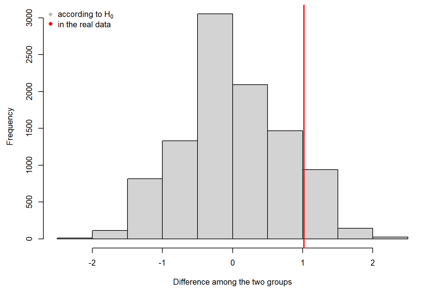
Figure 2.16: Histogram of differences between the means of random assignement of ell values to groups (grey), and the difference between the means of the two observed groups (red).
The randomisation test results in a p-value, and we could also report the observed difference between the group means. However, it does not tell us what values of the difference all would be compatible with the data. We do not get an uncertainty measurement for the difference. To get a compatibility interval without assuming a distribution for the data (thus non-parametric), we can use a method referred to as bootstrapping the samples.
Bootstrapping is sampling observations from the data, with replacements. For example, if we have a sample of 8 observations, we draw one of these observations randomly 8 times. Each time, all 8 observations are available (i.e. sampling with replacement). Thus a bootstrapped sample can include some observations several times, whereas others are missing. In this way, we simulate the variance in the data that comes from our data not including the entire population.
Bootstrapping can be programmed in R using a loop.
diffboot <- numeric(1000)
for(i in 1:nsim){
  ngroups <- 1
  while(ngroups==1){
    bootrows <- sample(1:nrow(dat), replace=TRUE)
    ngroups <- length(unique(dat$car[bootrows]))
    }
  rmod <- lm(ell~car, data=dat[bootrows,])
  diffboot[i] <- coef(rmod)[2]
}
quantile(diffboot, prob=c(0.025, 0.975))
## 2.5% 97.5%
## -0.3541667 2.3888889The resulting values for the difference between the two group means can be interpreted as the distribution of those differences, if we had repeated the study many times (Fig. 2.17). A 95% interval of the distribution corresponds to a 95% compatibility interval (or confidence interval or uncertainty interval).
hist(diffboot, main=NA, xlab="Difference among the two groups"); abline(v=coef(mod)[2], lwd=2, col="red")
legend("topleft",pch=16, col=c("gray","red"),legend=c("from bootstrap samples","in the real data"), bty="n")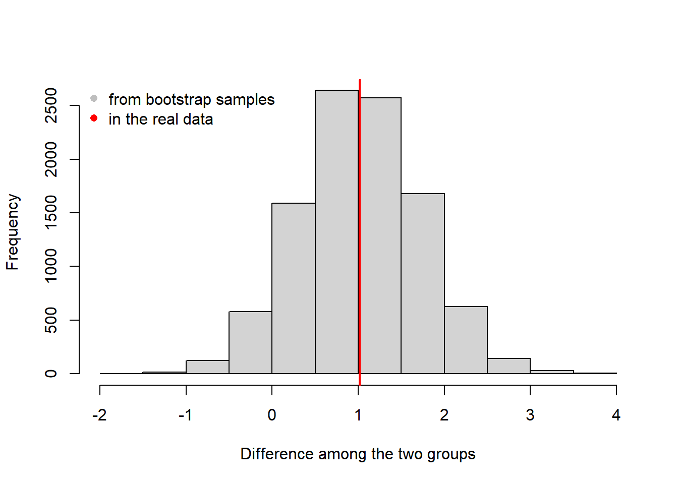
Figure 2.17: Histogram of the boostrapped differences between the group means (grey) and the observed difference.
For both, randomisation test and bootstrapping, we have to assume that all observations are independent. Randomisation and bootstrapping become complicated or even unfeasible when data are structured, i.e. when you want (or better: need) to consider other groups or important linear predictors.
2.6 Comparing frequentist and Bayesian approach - and why we use Bayes
An important difference between the Bayesian and frequentist ways of analyzing data is how conclusions are drawn (Table 2.3). Bayesians are interested in the probability of a (meaningful) hypothesis (e.g., that an effect is larger than a relevant size, say, \(H: \theta > e\)) given the data, \(p(H|y)\), or they describe what we know about a parameter after having looked at the data by the posterior distribution \(p(\theta|y)\). Frequentist methods assess the probability of the data given a null hypothesis, \(p(y|H_0)\), or they give estimates with a standard error for specific model parameters.
The second important difference is that Bayesians combine prior information with information that is obtained from data, whereas frequentists solely infer from the data at hand. Because prior information may influence inference, some people have been resistant to using Bayesian statistics. However, if prior influence is reported transparently, the degree of information in the data becomes even clearer than without any prior influence. Bayesian statistics provides the theory to combine information from different sources and, therefore, meta-analyses become relatively simple using Bayesian analysis.
| Bayesian statistics | Frequentist statistics | |
|---|---|---|
| Interpretation of probability | Description of what we know about a parameter | Relative frequency of an event |
| Information used | Prior distribution \(p(\theta)\) and likelihood \(p(y|\theta)\), i.e., data | Data only |
| Uncertainty measurement | Compatibility interval (or credible interval) | Confidence interval |
| Hypotheses | Probability of meaningful hypotheses \(p(H|y)\) | Null hypothesis tests \(p(y|H_0)\) |
Doing science consists of updating prior knowledge with information from experiments or observations to obtain new (posterior) knowledge about a parameter. The Bayesian way of analyzing data formalizes the learning process of science. One of the reasons for the development of frequentist statistics was that it was not feasible to do the simulation part of Bayesian statistics before the computer age (because of the earlier application of frequentist statistical methods, they are sometimes called the “classical” statistical methods, even though the idea of Bayes is older). Nowadays, everybody can use their own computer to draw values from posterior distributions very easily.
Some scientists reject Bayesian statistics mainly because they argue that using prior information makes a study subjective (see, e.g., the discussion in the Forum of Ecological Applications, 19, 2009). However, we argue that frequentist analysis is subjective, too! Subjectivity enters at many levels, from deciding what questions to investigate, which data to collect, which results to publish, and so on. Using prior information is not the only subjective step during a data analysis - the key thing is to report what has been done. A famous statistician once asked us whether we had ever laughed out loud at a statistical result because it absolutely did not make any sense? If yes, this is clear evidence that we have prior knowledge; clearly it is reasonable to report this prior knowledge and use it in the analysis.
In this book, we primarily use Bayesian methods because they allow more meaningful inferences (i.e., probabilities of specific hypotheses, or posterior distributions for derived quantities - we will do that in the book several times). In fact, in the case of generalized linear mixed models (Chapter 15), they are the only exact way to draw inferences (Bolker et al. 2009). Bayesian methods make the fit of more complex models (such as models that estimate a true state together with an observation process) feasible. They make meta-analysis relatively simple. And error propagation to derived parameters (e.g., to create an effect plot) is ridiculously easy: As a result from a Bayesian analyses, we get many, e.g., 4000, draws from the joint posterior distribution, i.e. 4000 sets of parameters. Whichever derived quantity we are interested in, we simply calculate it using each draw in turn, giving us 4000 values for the derived parameter, which represents the uncertainty of that derived parameter (the 2.5% and 97.5% quantiles of these 4000 values can be used as a 95% compatibility interval).
While our book clearly focuses on Bayesian analyses, we also briefly introduce the most important classical frequentist tests associated with linear models. We do this because they are still widely used, and because almost 100 years of scientific literature has used these techniques that we, as readers, would like to understand.
2.7 Summary
Bayesian data analysis is applying the Bayes theorem for summarizing knowledge based on data, priors, and the model assumptions.
Frequentist statistics is quantifying uncertainty by hypothetical repetitions.
The Bayesian approach to statistical modelling offers the following advantages over the frequentist approach:
- Unbiased parameter estimates in the context of mixed models
- Specific hypotheses can be tested
- Prior knowledge, if available, can be incorporated
- Meta-analyses are relatively simple
- Error propagation to derived parameters is ridiculously simple
- More complex models can be fitted, with more modelling flexibility